| 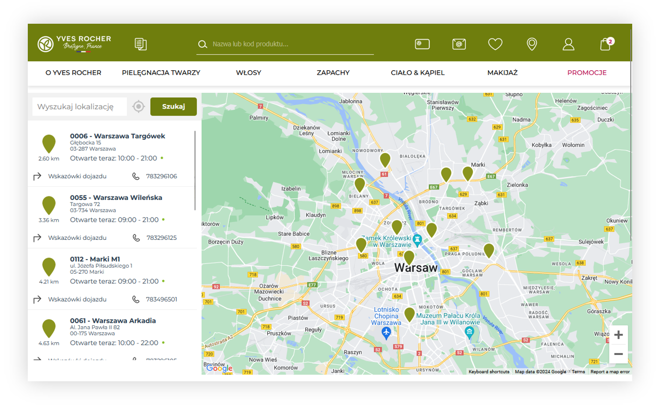 |
| *Visualization of the store locator* |
| 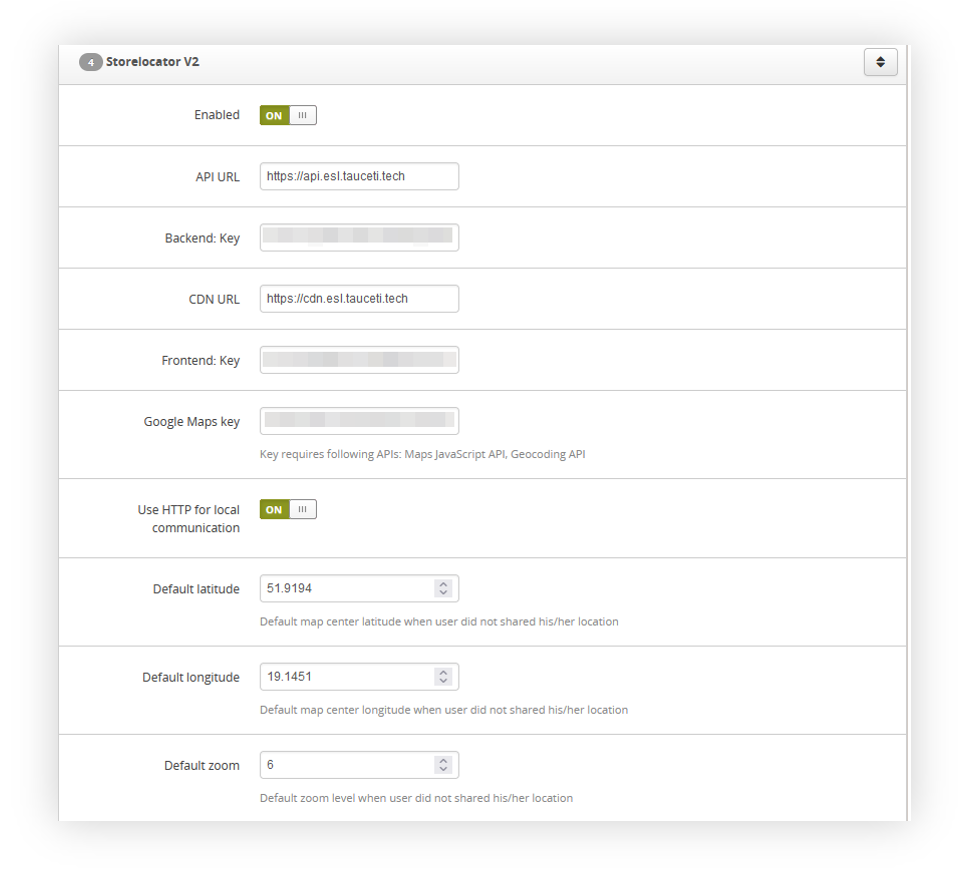 |
| *Visualization of the storelocator system settings* |
| 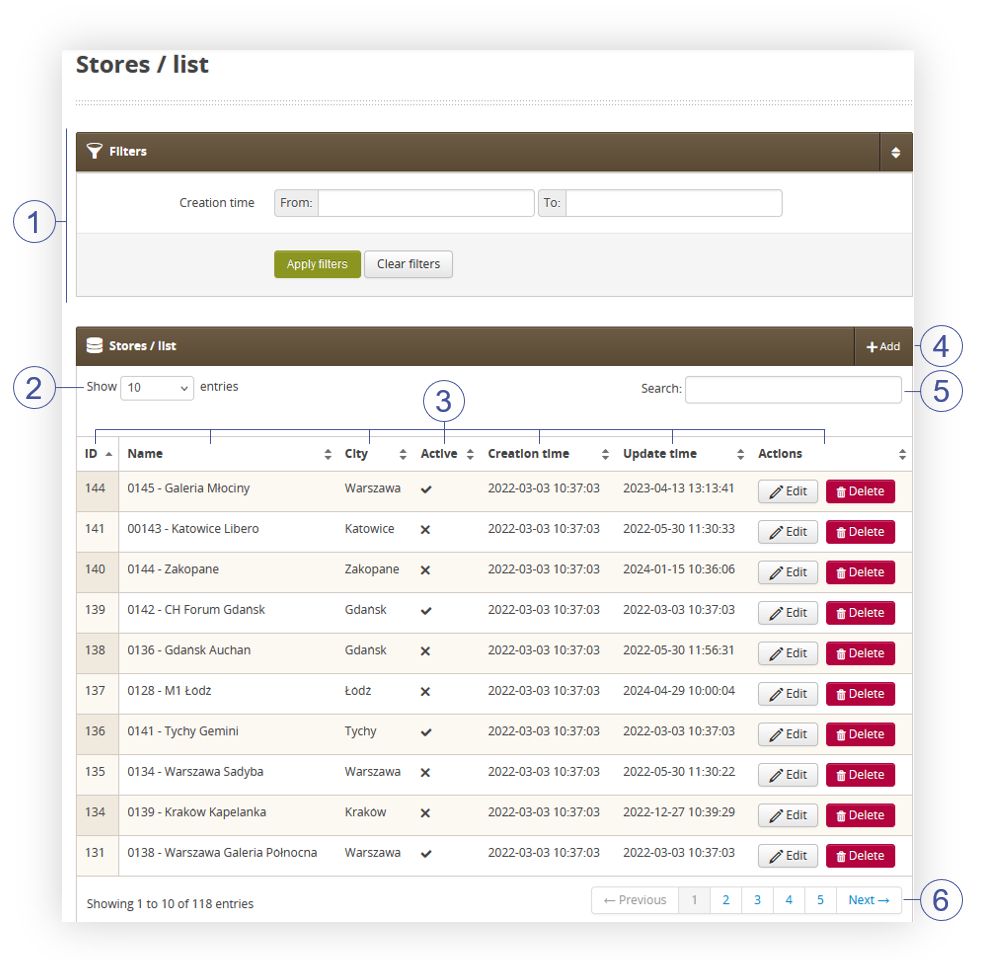 |
| *Visualization of stores in stores / list* |
| 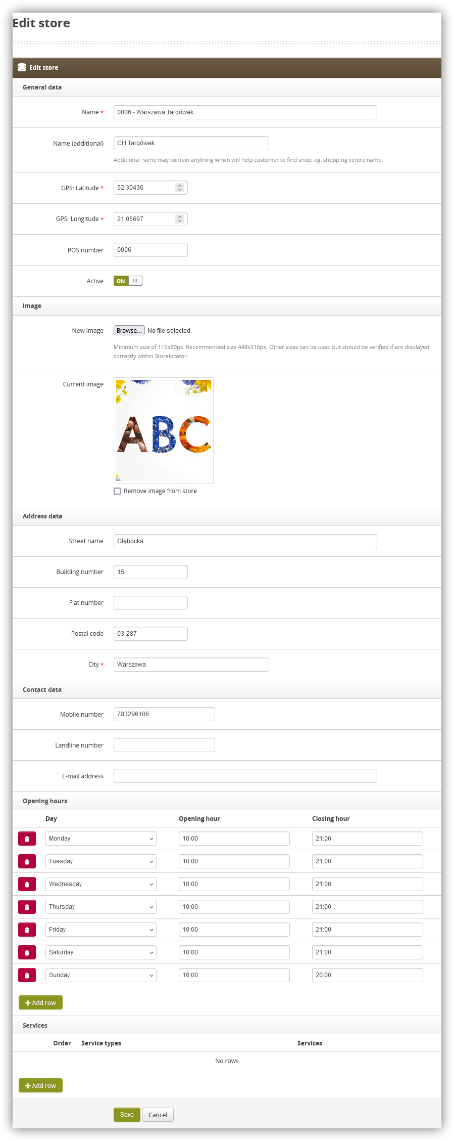 |
| *Visualization of the store creation* |
|  |
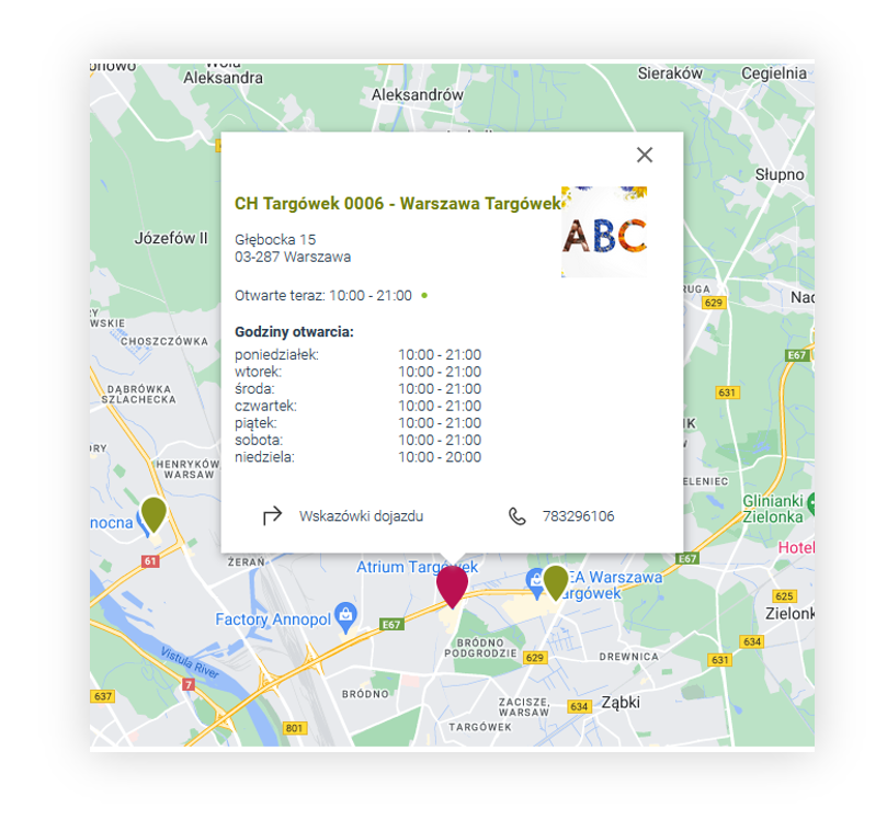
| *Visualization of the store locator* |
|  |
| *Visualization of the store locator* |
| 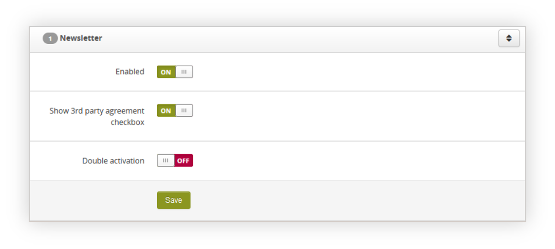 |
| *Visualization of the newsletter functionality system settings* |
| 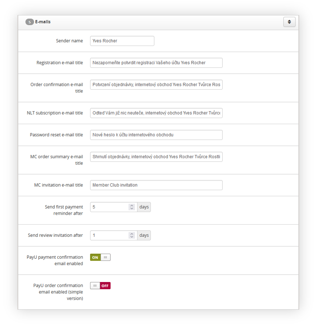 |
| *Visualization of the E-mails tab in the System / Settings* |
| 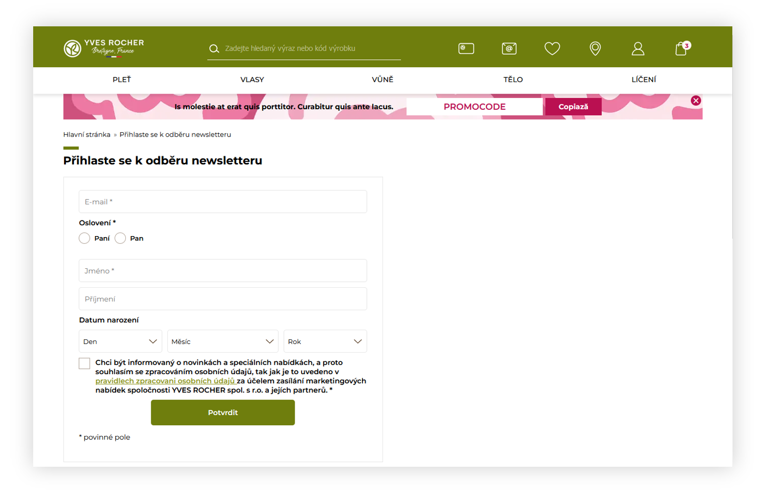 |
| *Visualization of the /newsletter page* |
| 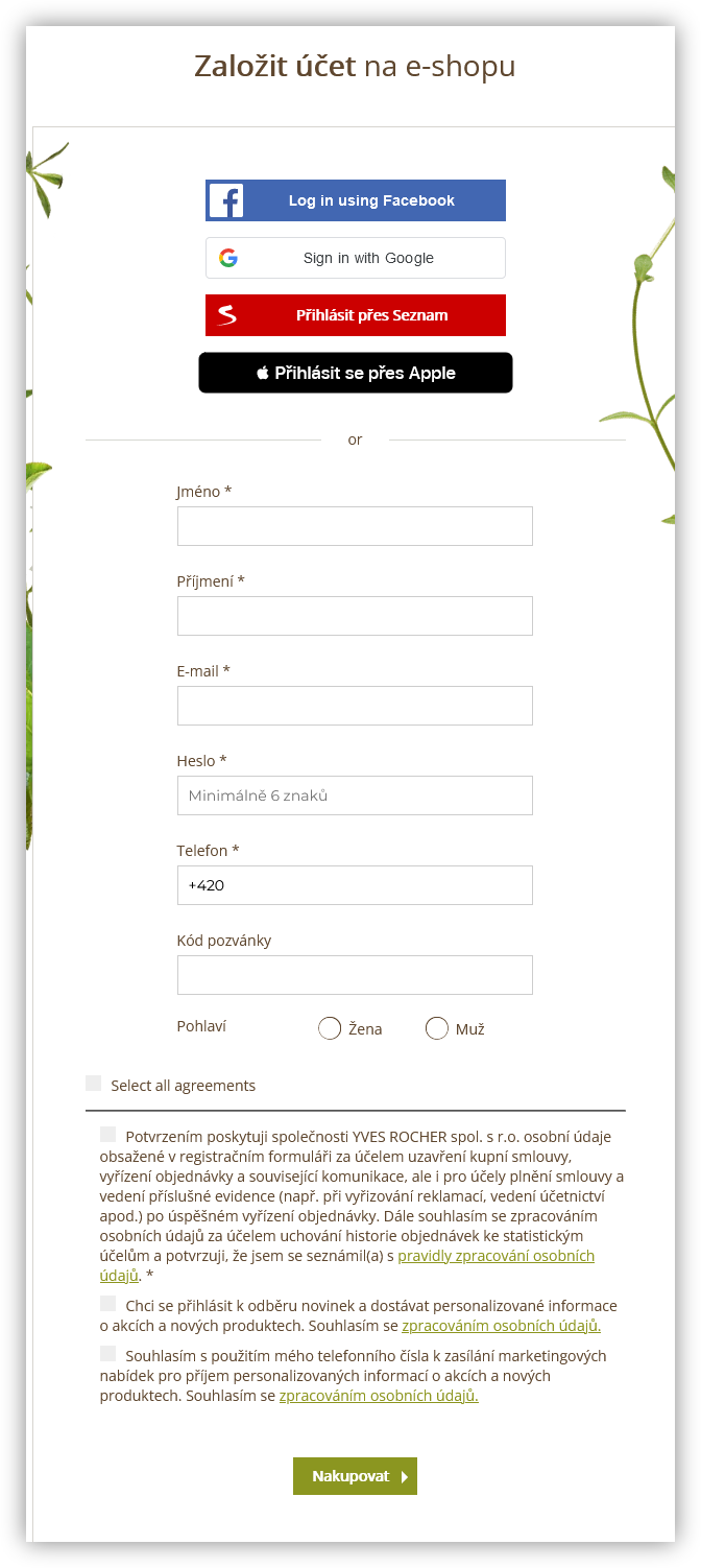 |
| *Visualization of the registration form* |
|  |
| *Visualization of the /customer/newsletter page* |
|  |
| *Visualization of the /customer/newsletter page* |
| 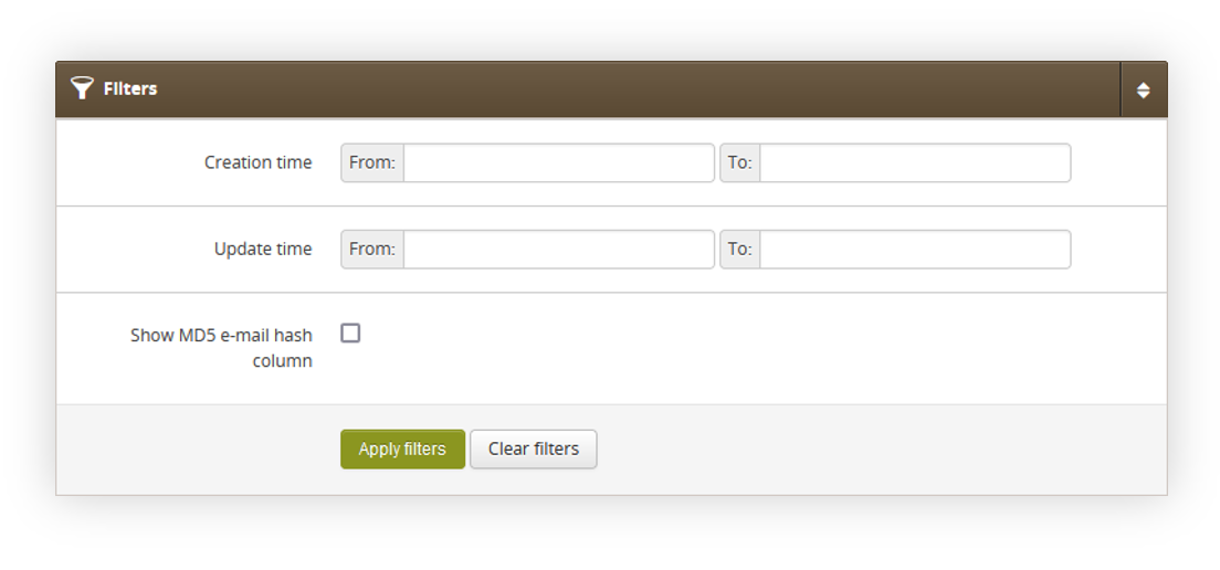 |
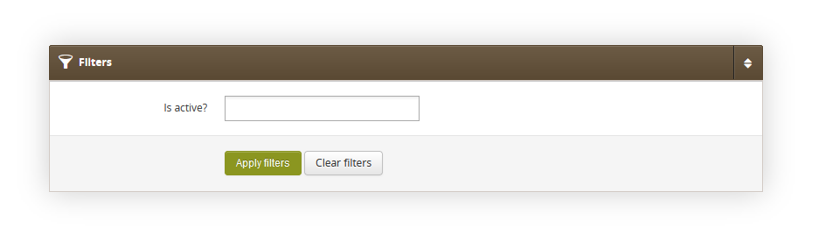
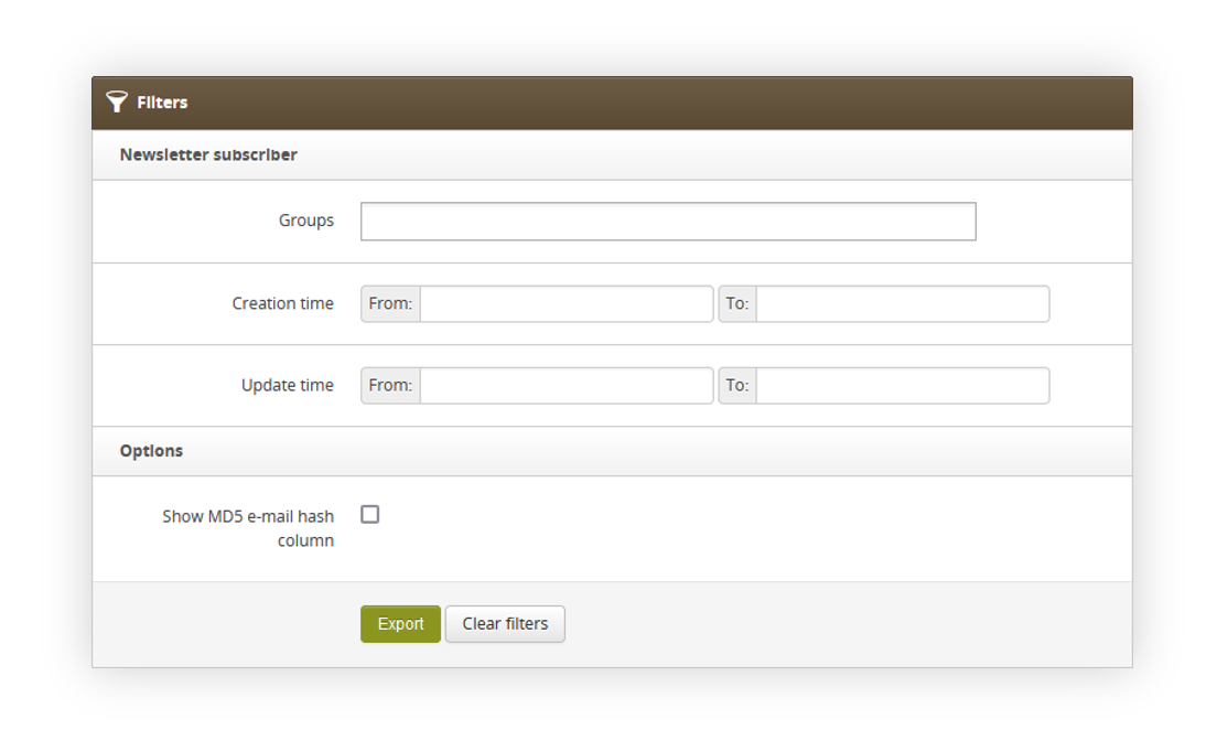
| *Visualization of the Subscribers / list filters* |
| 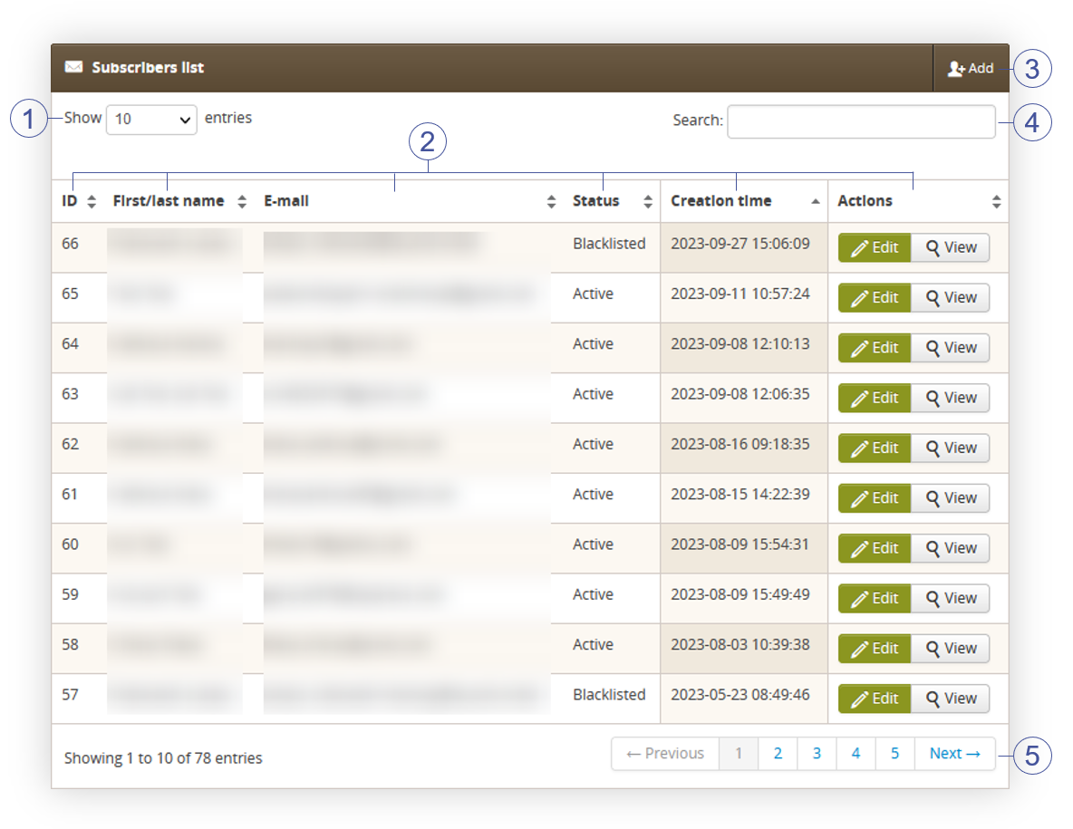 |
| *Visualization of the Subscribers list tab* |
| 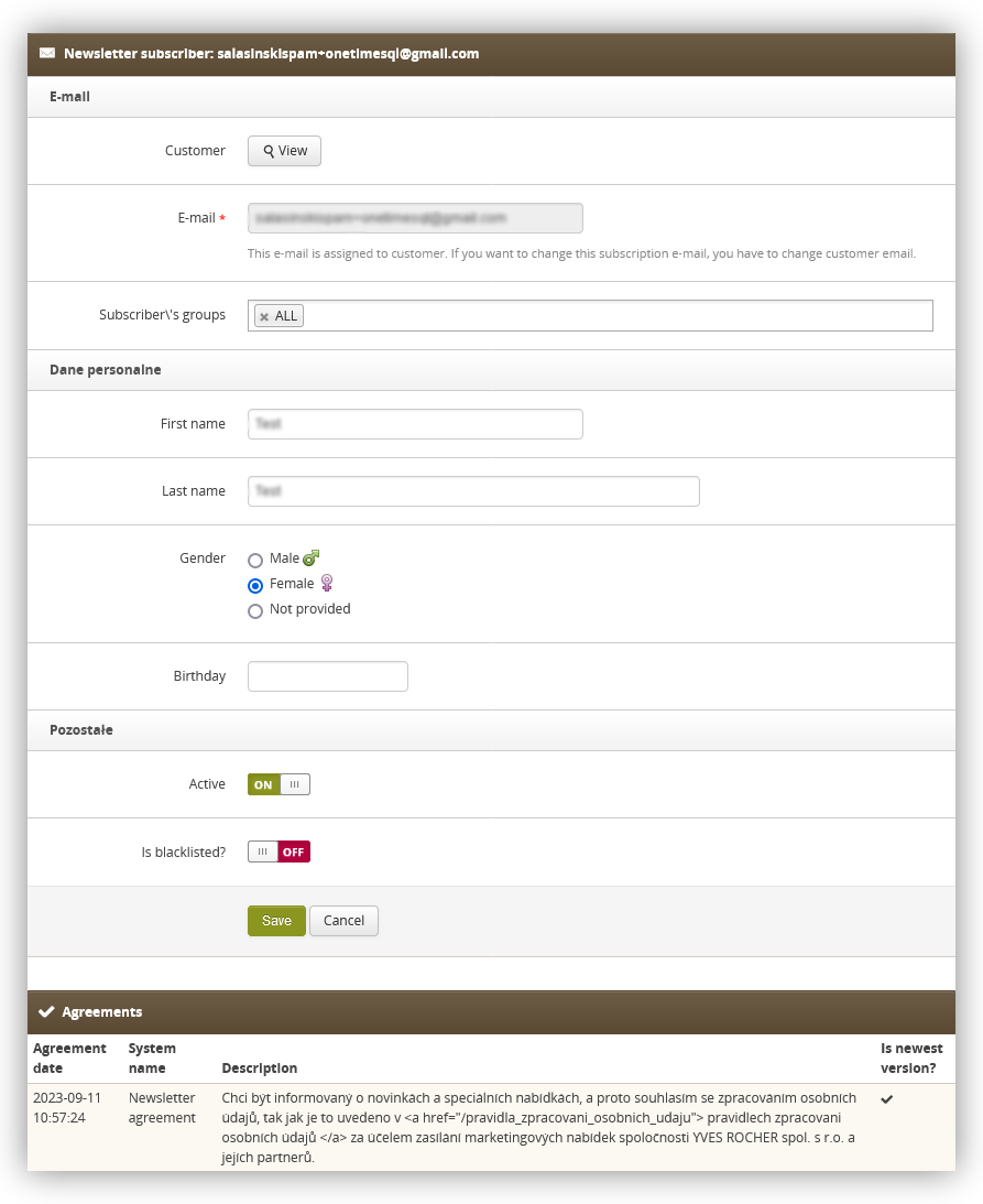 |
| *Visualization of the customer in the subscribers / list* |
|  |
| *Visualization of the filters in subscribers groups.* |
| 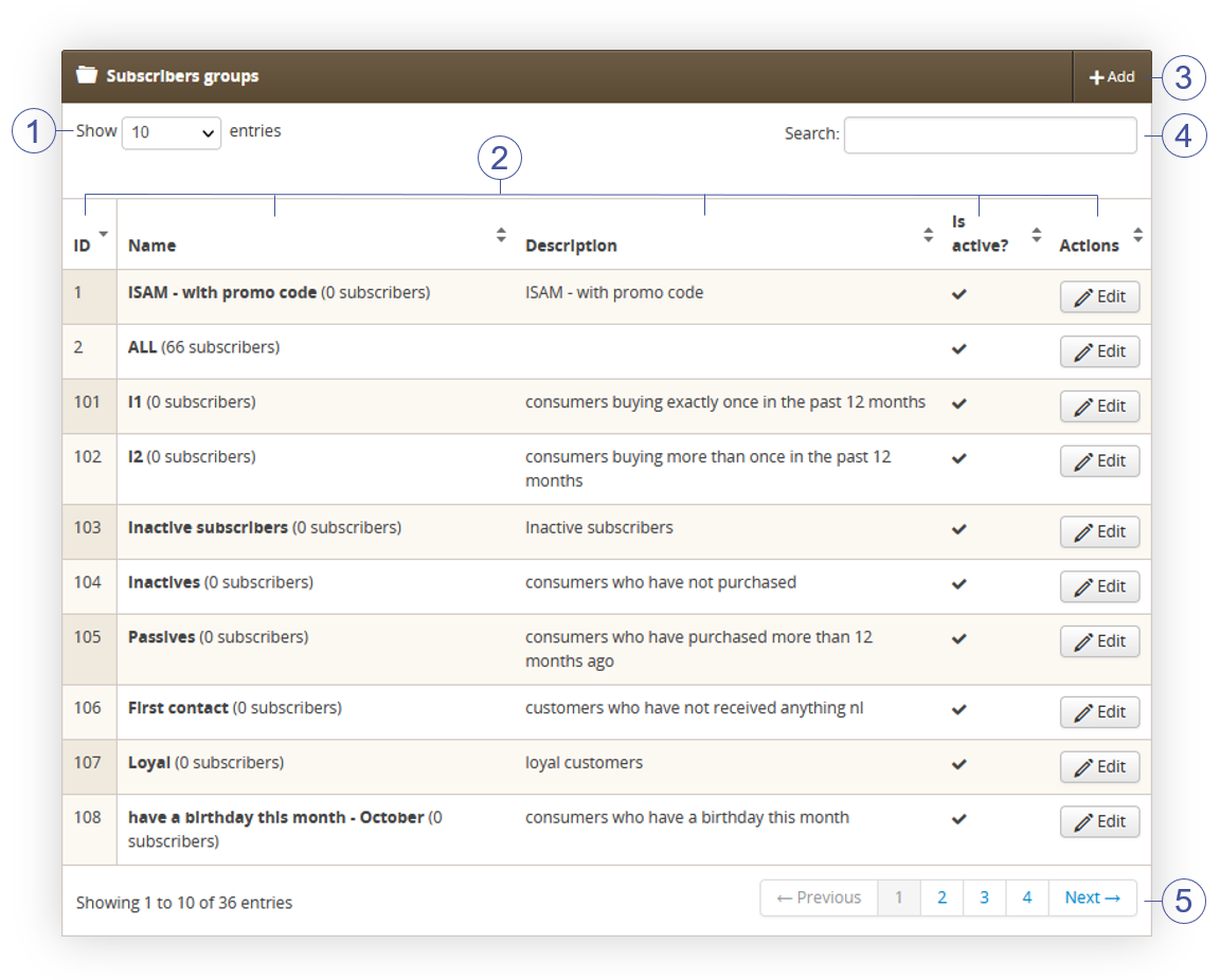 |
| *Visualization of the subscribers groups* |
| 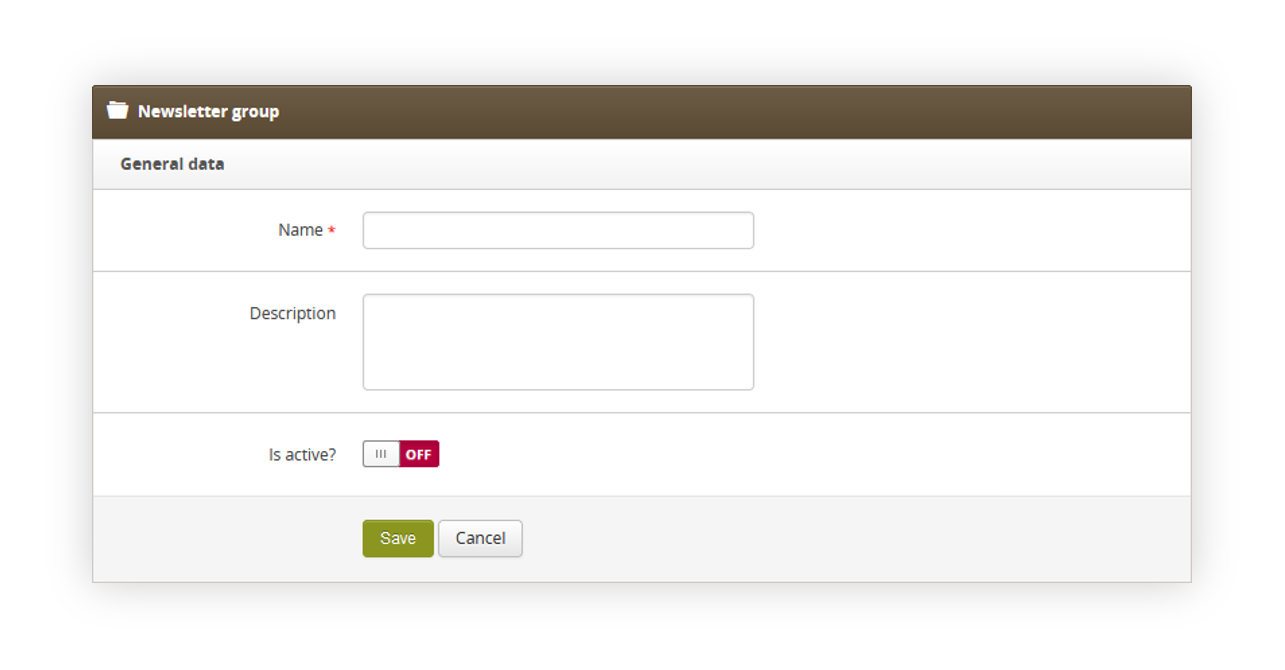 |
| *Visualization of the subscriber group creation* |
| 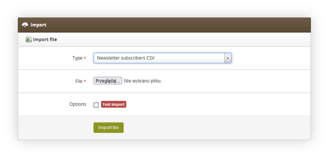 |
| *Visualization of the subscribers import* |
| 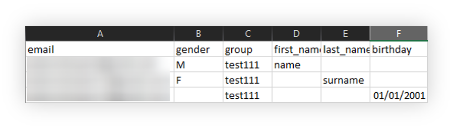 |
| *Visualization of the subscribers csv file* |
|  |
| *Visualization of the subscribers csv file* |
| 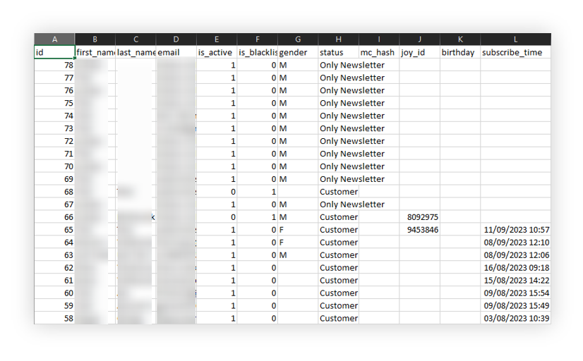 |
| *Visualization of the exported subscribers file* |
|  |
| *Visualization of the invitation e-mail* |
| 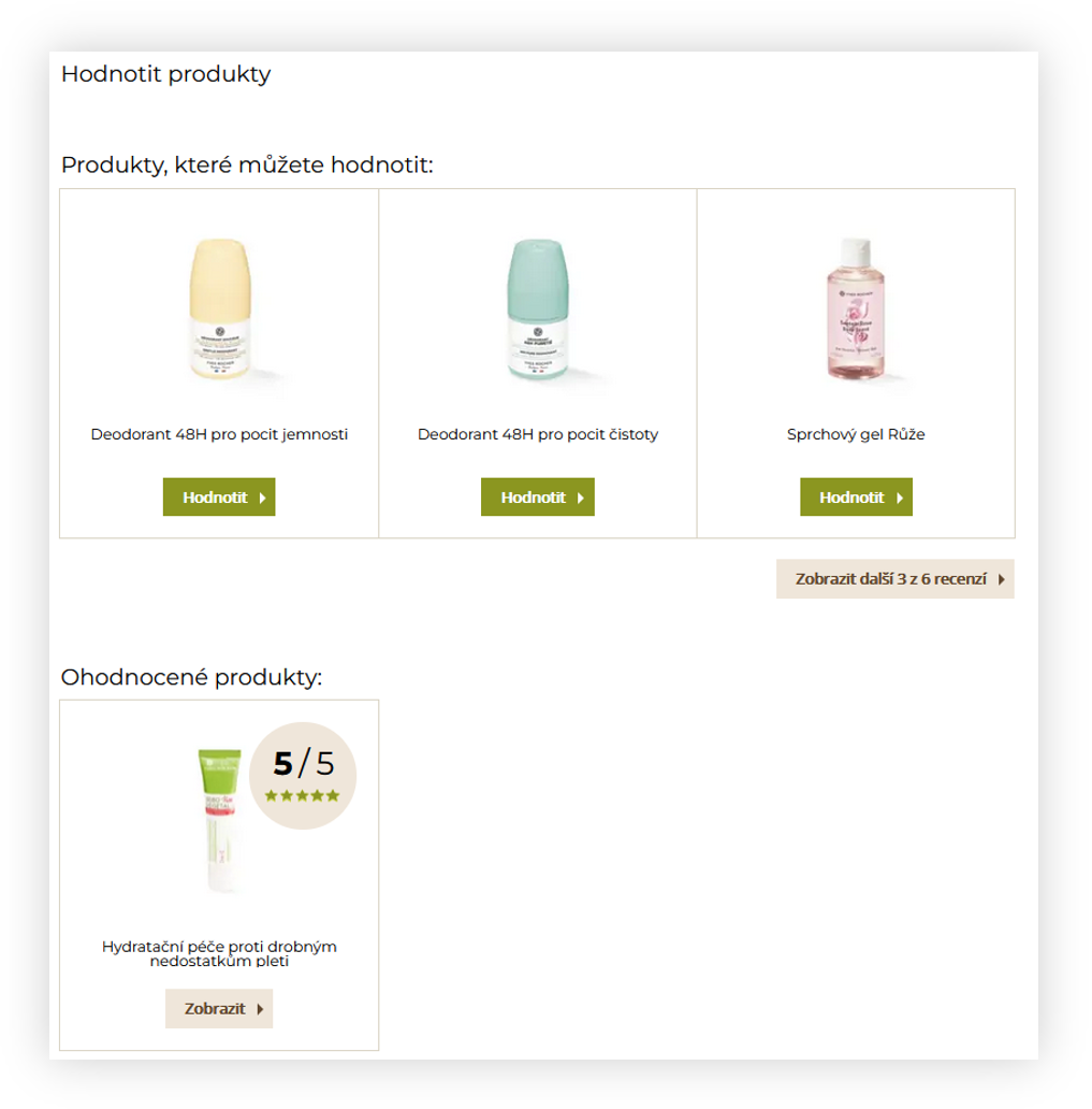 |
| *Visualization of the customer panel reviews page* |
| 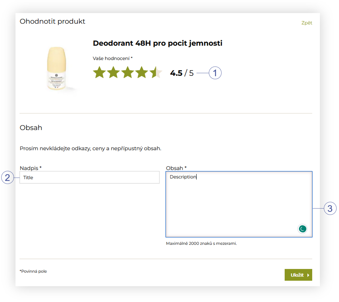 |
| *Visualization of the review creation page* |
| 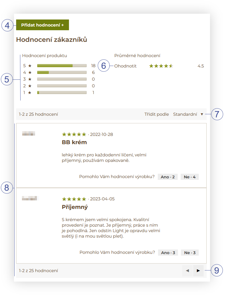 |
| *Visualization of the reviews on the product page* |
| 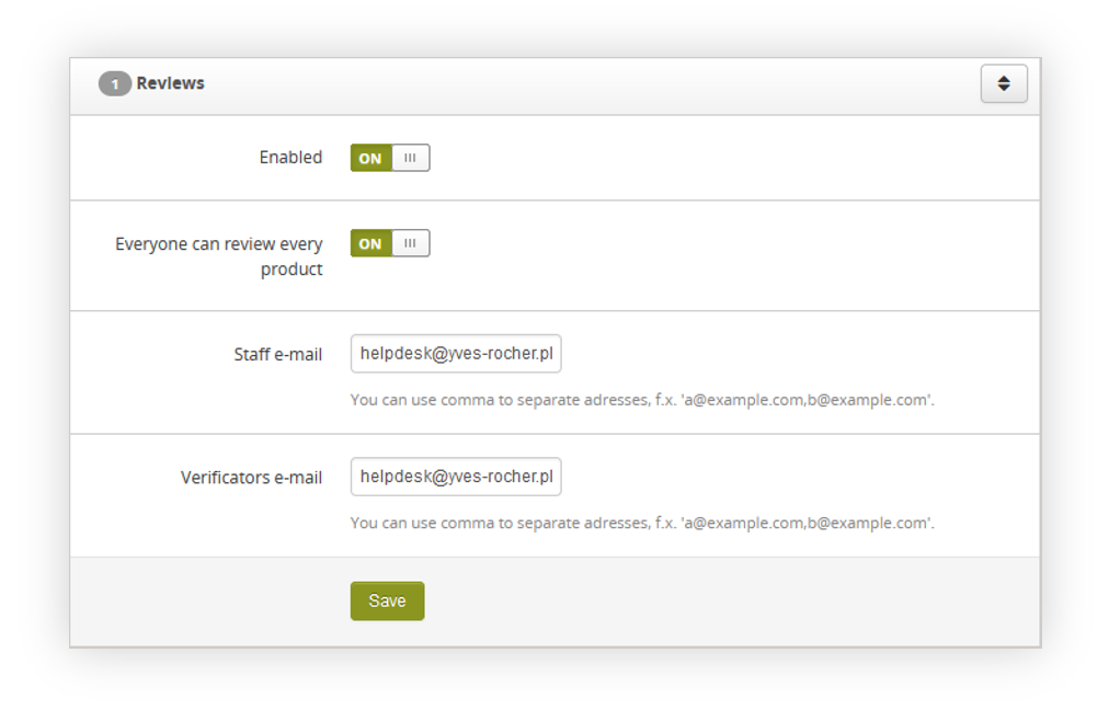 |
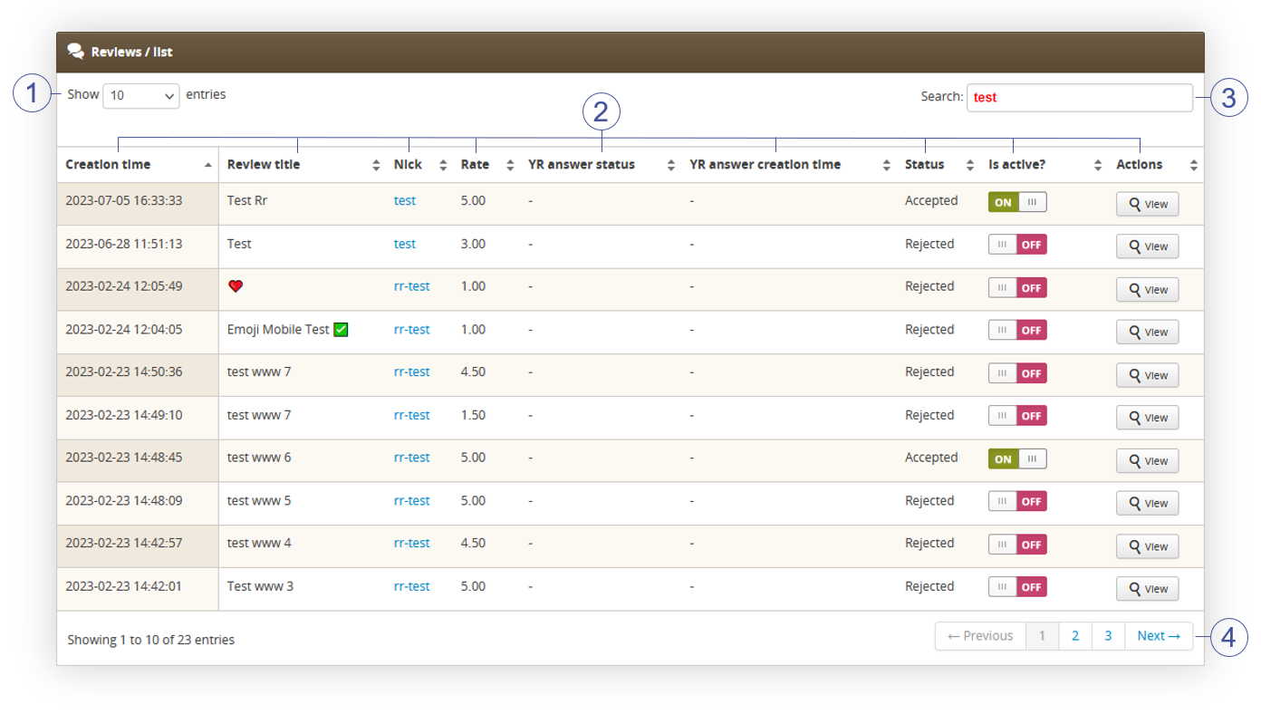
| *Visualization of the reviews tab* |
| 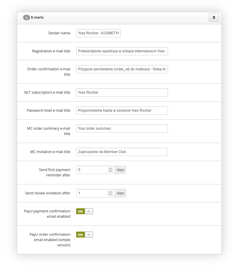 |
| *Visualization of the e-mails tab* |
| 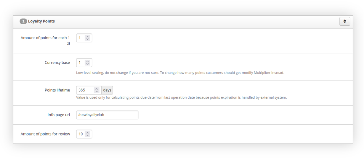 |
| *Visualization of the loyalty points tab* |
| 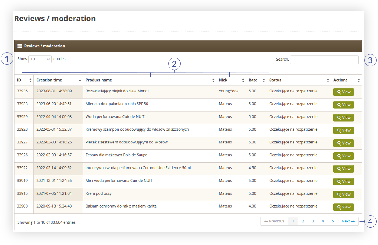 |
| *Visualization of the reviews moderation page* |
| 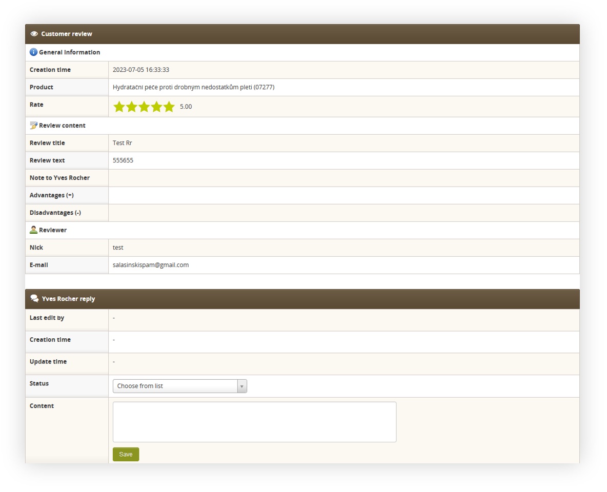 |
| *Visualization of the review details* |
|  |
| *Visualization of the* |
|  |
| *Visualization of the* |
|  |
| *Visualization of the review details* |
| 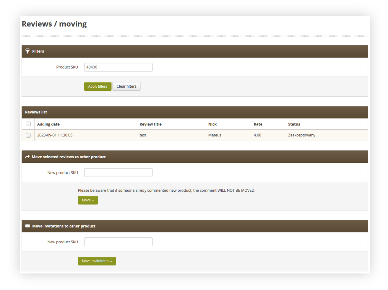 |
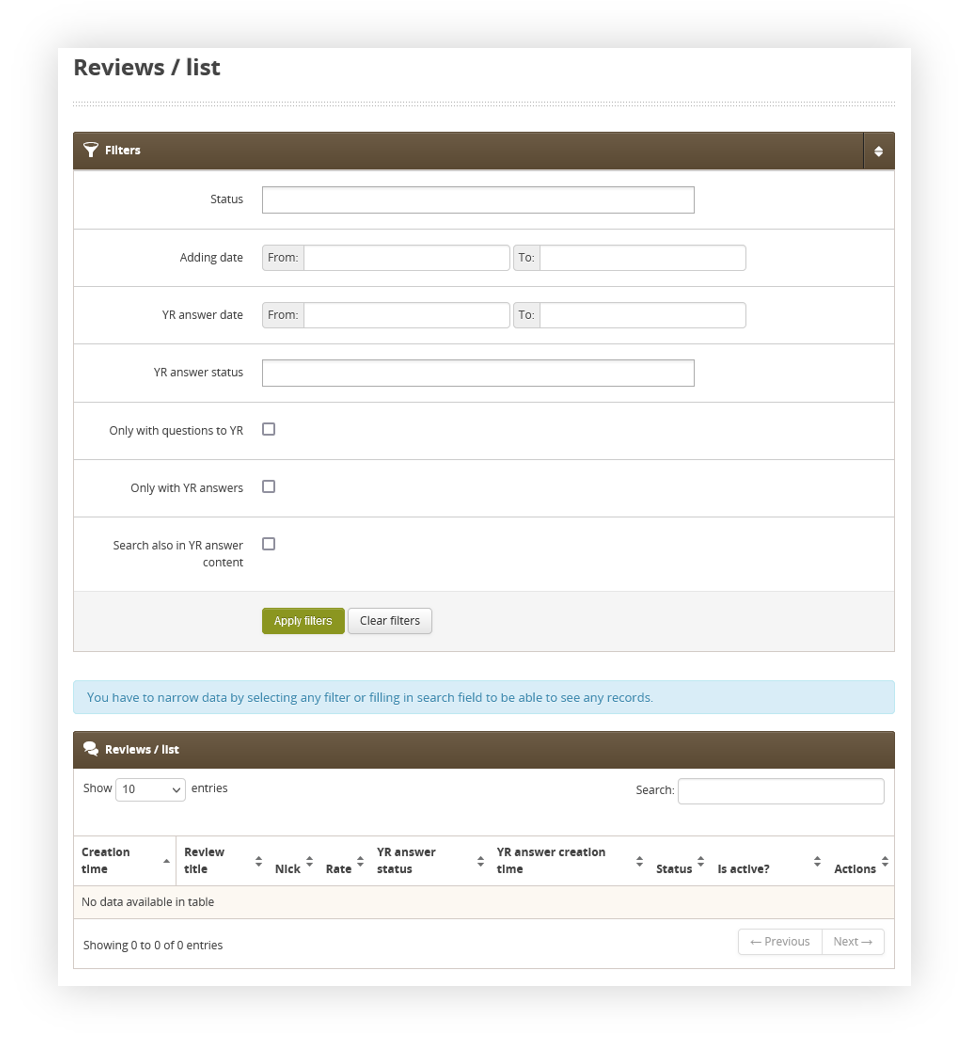
| *Visualization of the reviews moving page* |
|  |
| *R&R diagram* |
| 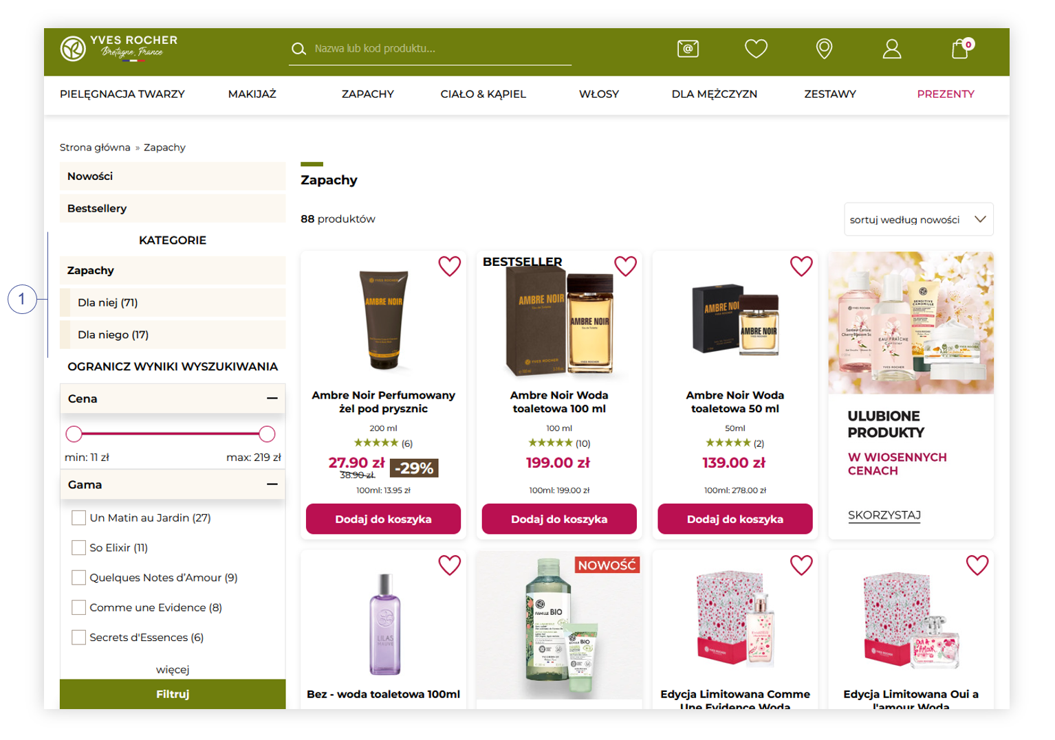 |
| *Visualization of the product category page* |
| 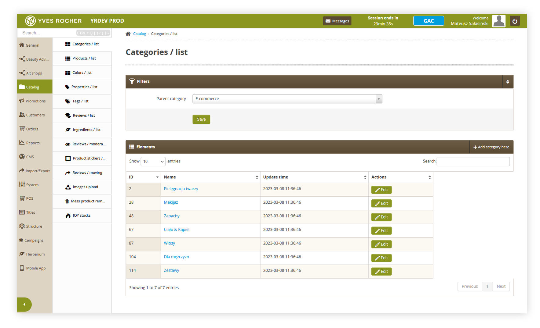 |
| *Visualization of the categories / list tab* |
| 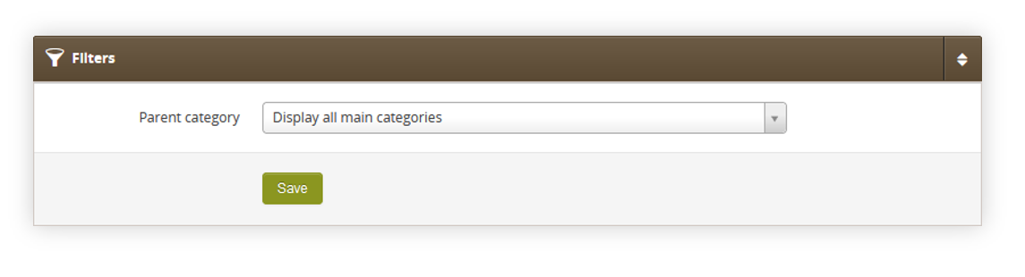 |
| *Visualization of the filters section* |
| 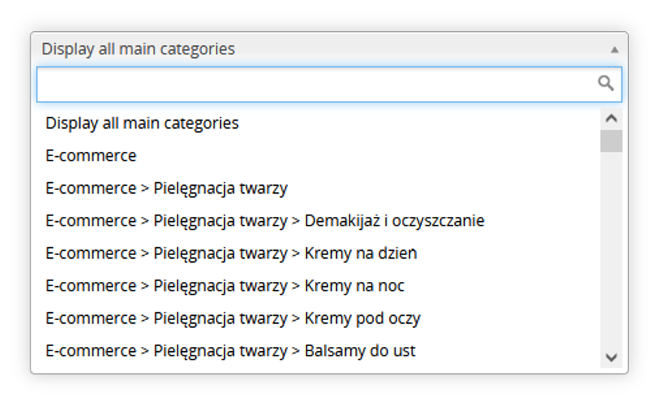 |
| *Visualization of the categories drop-down menu* |
| 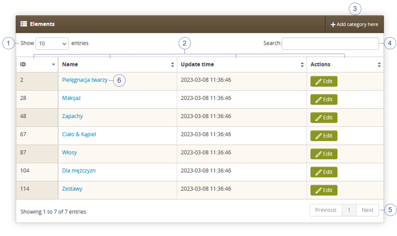 |
| *Visualization of the elements section* |
| 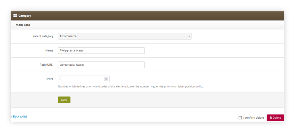 |
| *Visualization of the editing of a category* |
| 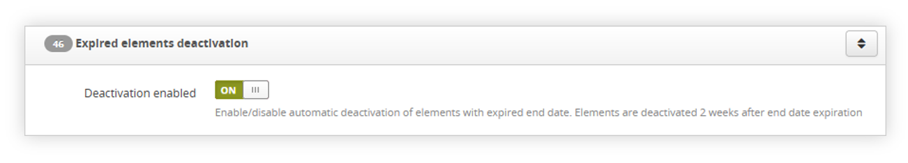 |
| *Visualization of the functionality system settings* |
|  |
| *Visualization of the delivery point widget functionality* |
| 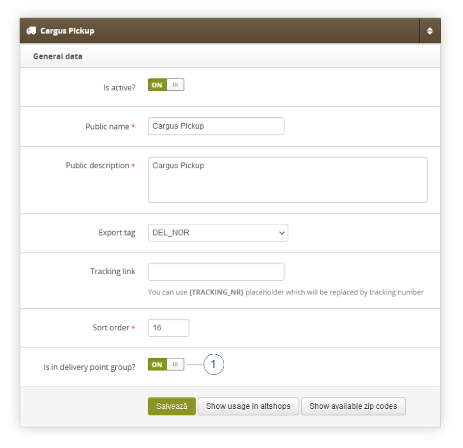 |
| *Visualization of the delivery types / list* |
| 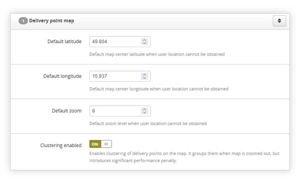 |
| *Visualization of the delivery point map settings* |
| 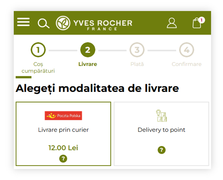 |
| *Visualization of the delivery method step in the cart process* |
| 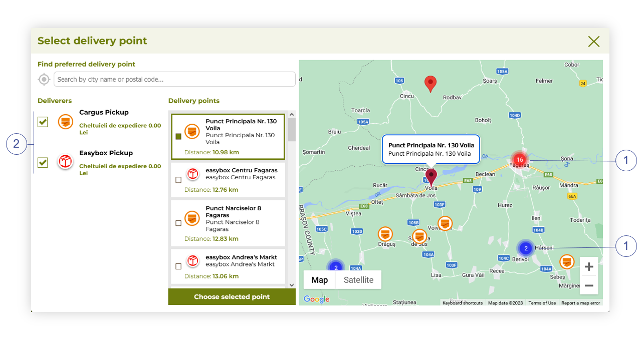 |
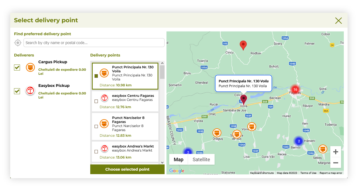
| *Visualization of the delivery point map (desktop)* |
| 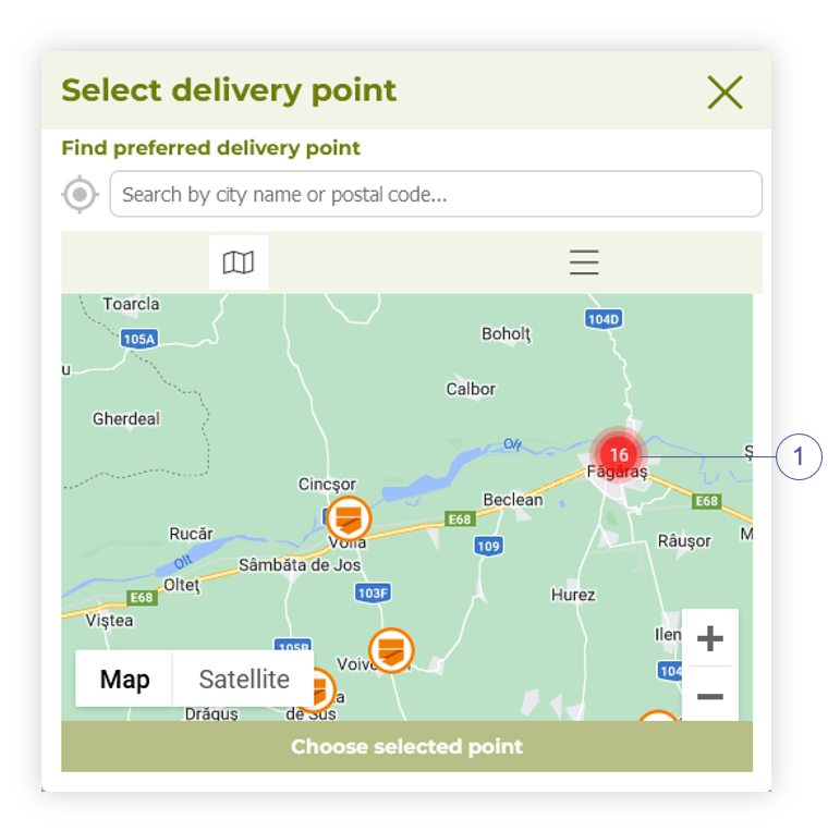 |
| *Visualization of the delivery point map (mobile)* |
| 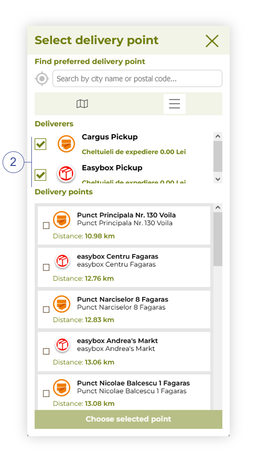 |
| *Visualization of the delivery points (mobile)* |
| 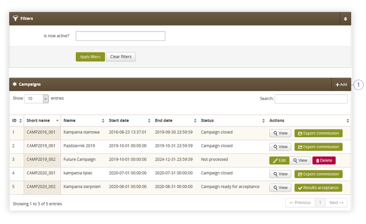 |
| *Visualization of the campaigns list* |
| 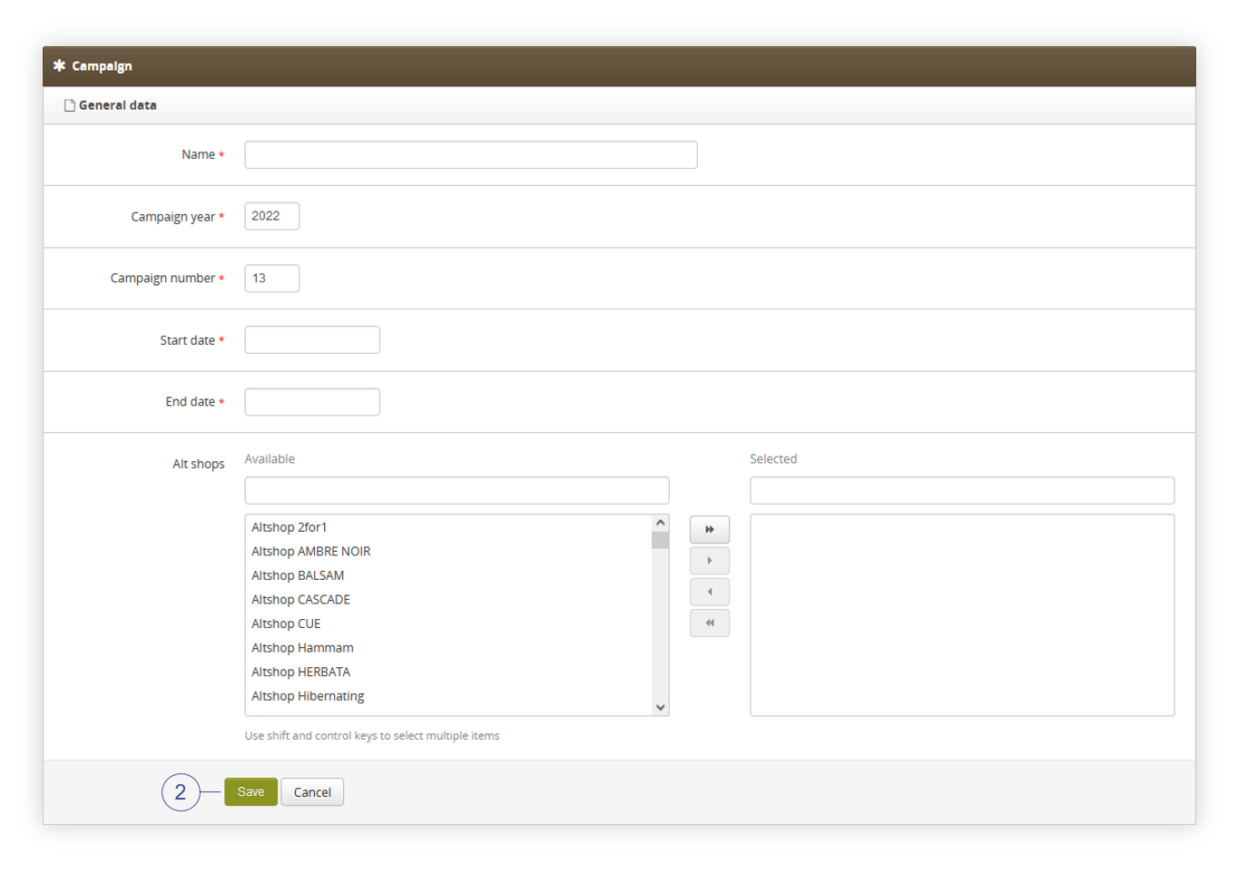 |
| *Visualization of the creating of the new campaign* |
| 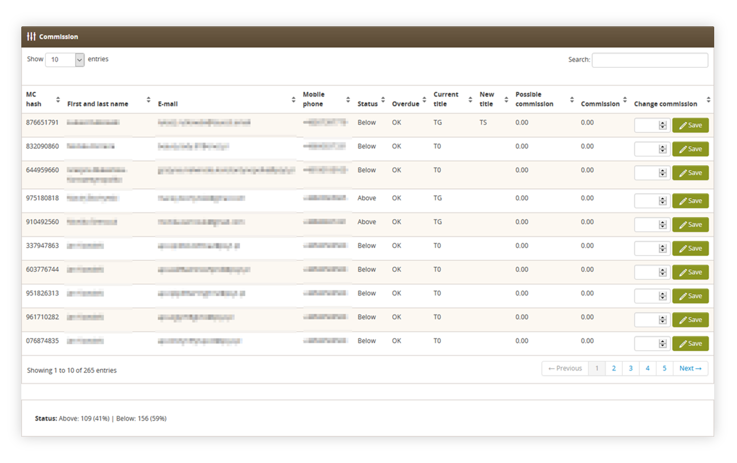 |
| *Visualization of the commision view* |
| 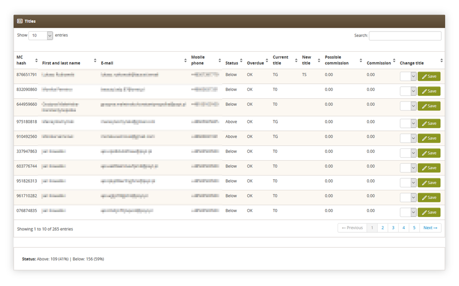 |
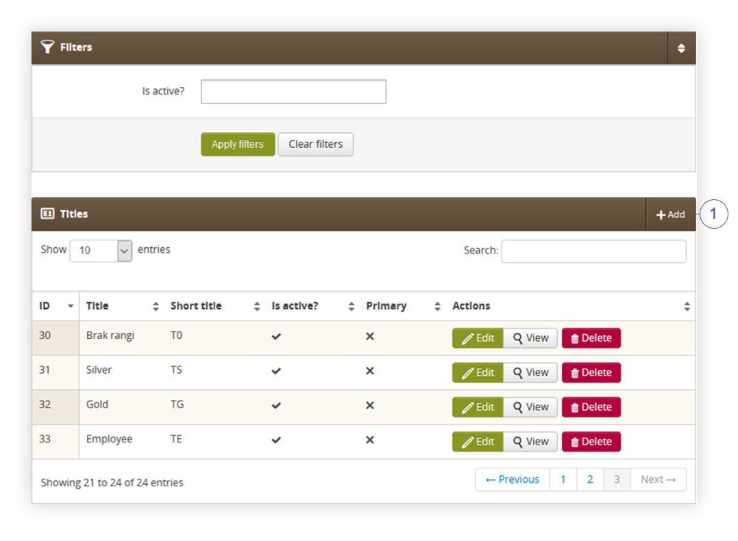
| *Visualization of the titles view* |
| 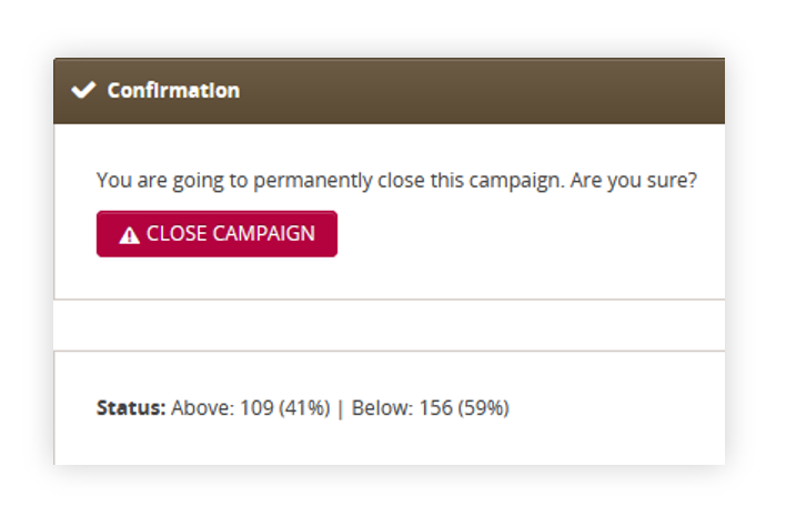 |
| *Visualization of the confirmation view* |
|  |
| *Visualization of the titles section* |
| 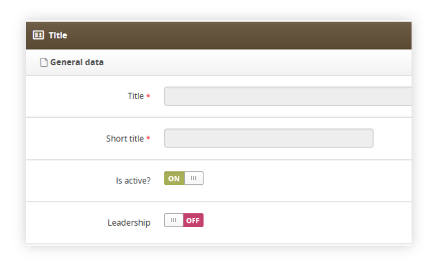 |
| *Visualization of the title section* |
| 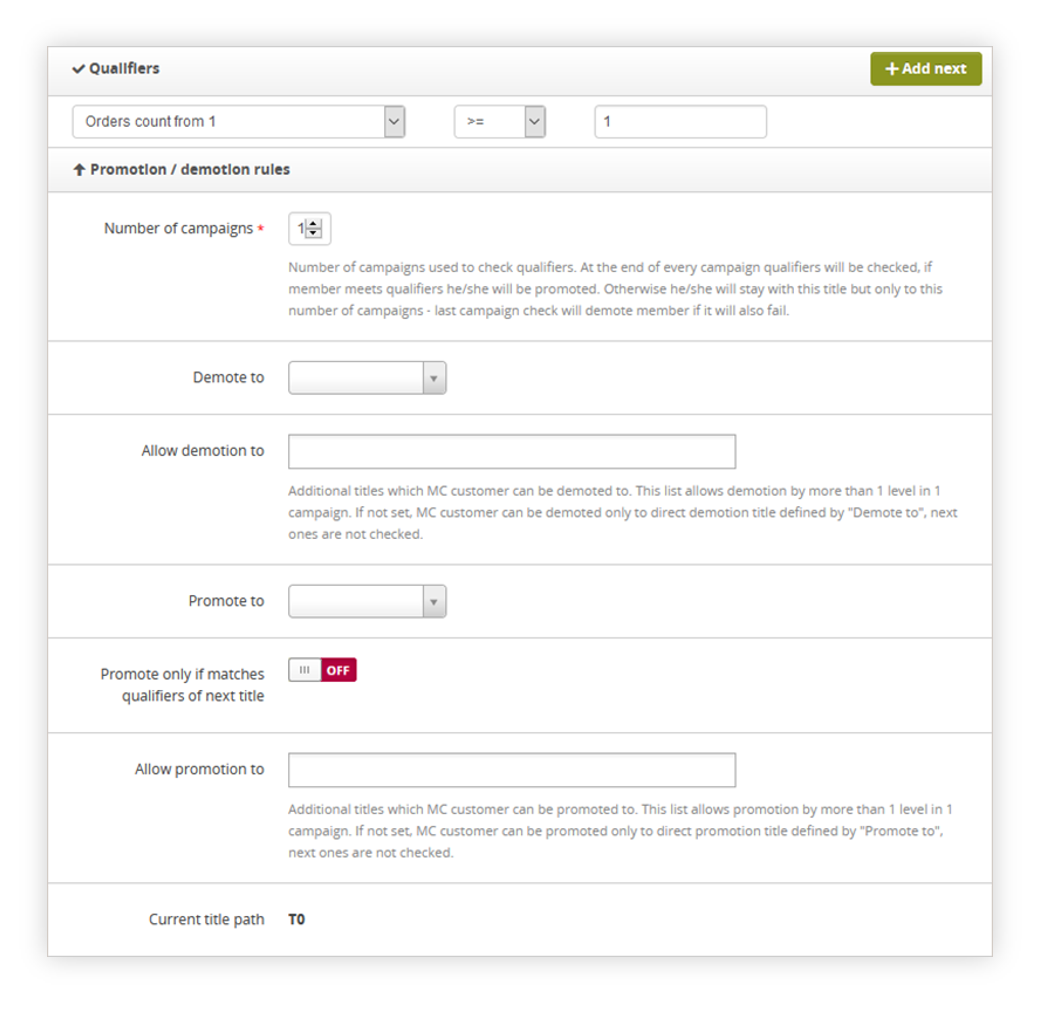 |
| *Visualization of the Qualifiers and Promotion / demotion sections* |
| 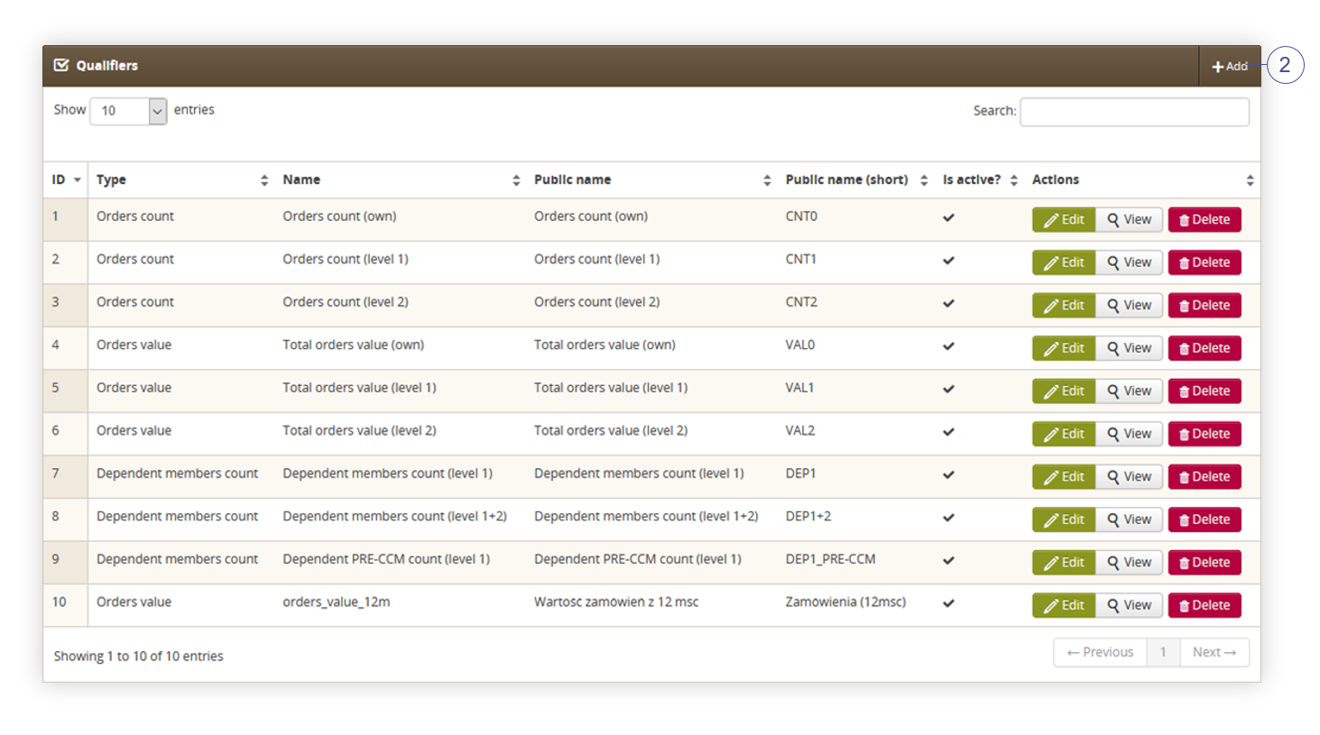 |
| *Visualization of the qualifiers section* |
| 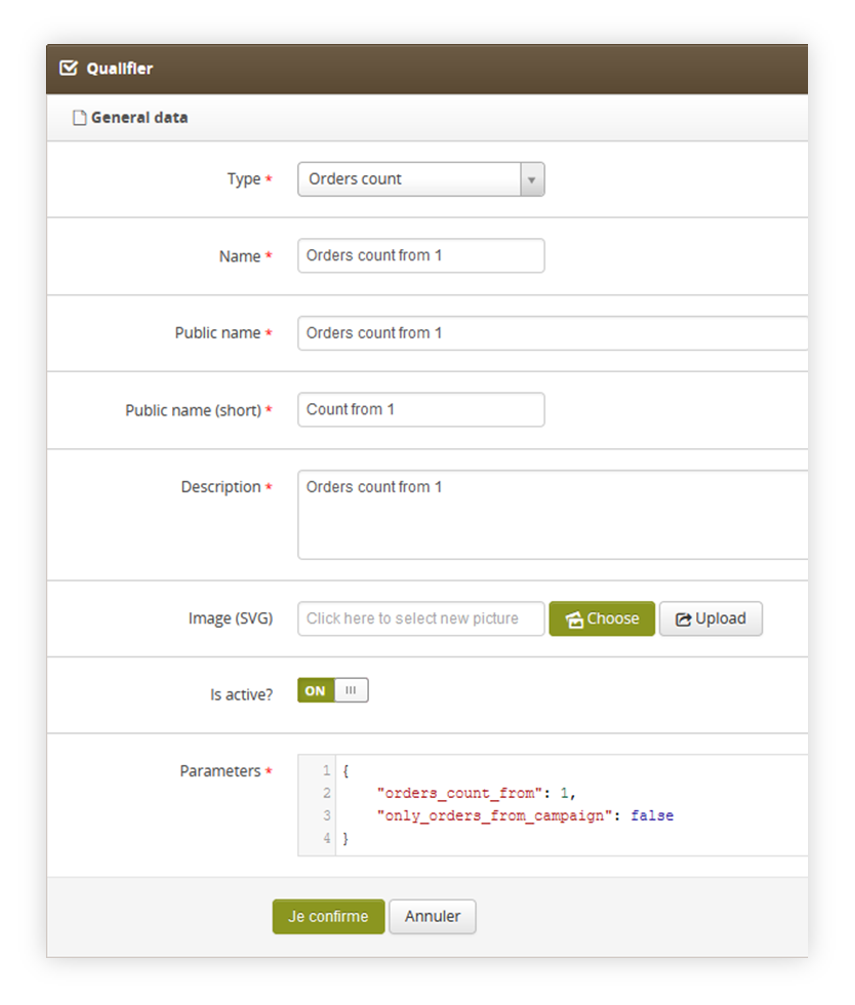 |
| *Visualization of the qualifiers section* |
| 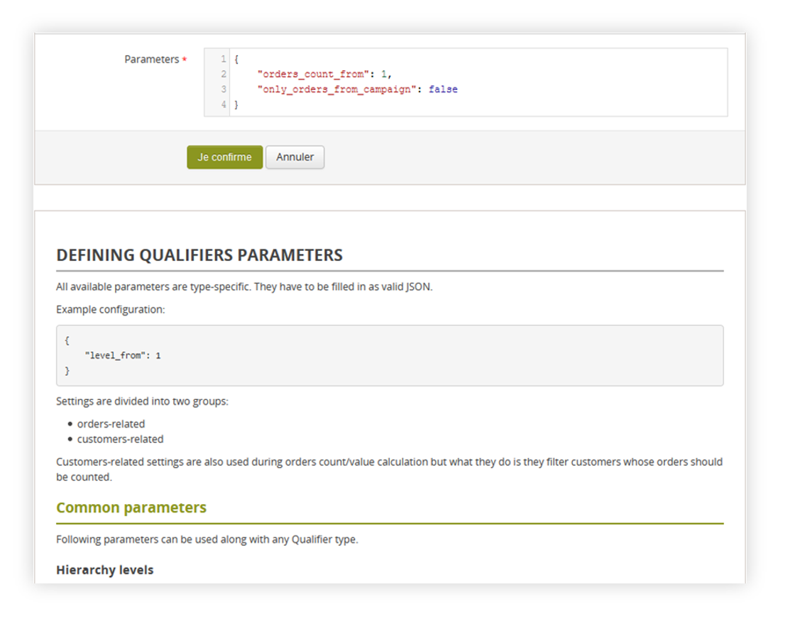 |
| *Visualization of the parameter documentation* |
|  |
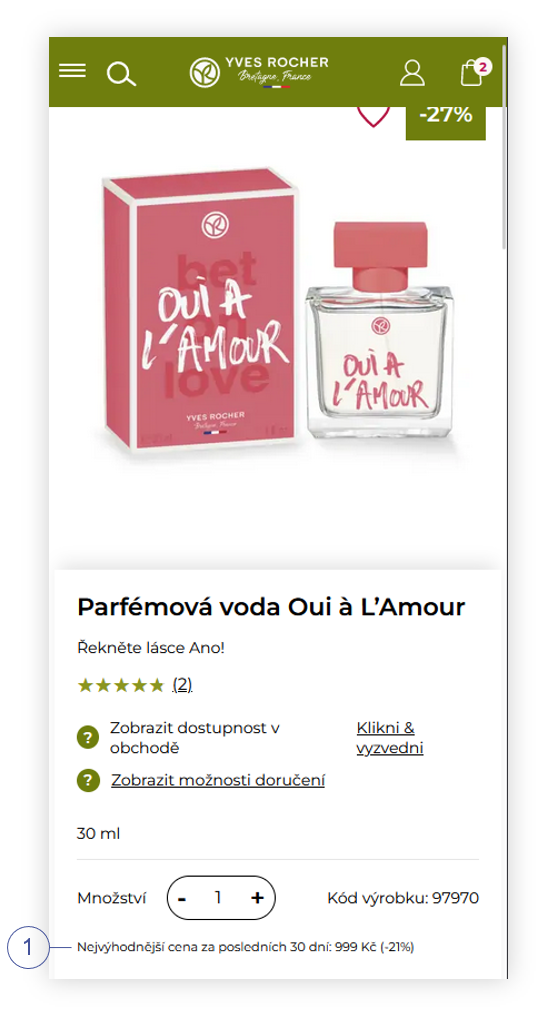
| *Visualization of the omnibus functionality on a product page (desktop)* |
|  |
| *Visualization of the omnibus functionality on a product page (mobile)* |
| 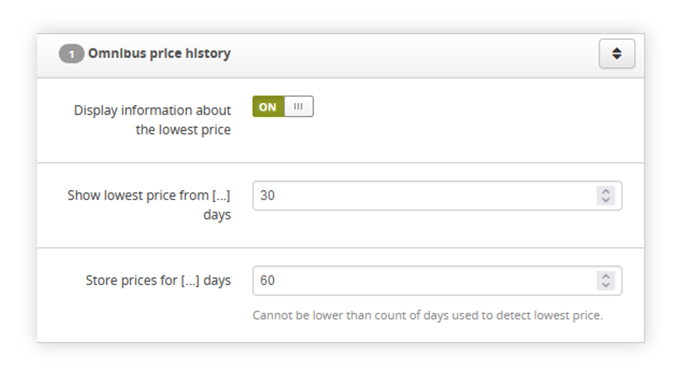 |
| *Visualization of the omnibus price history system settings* |
| 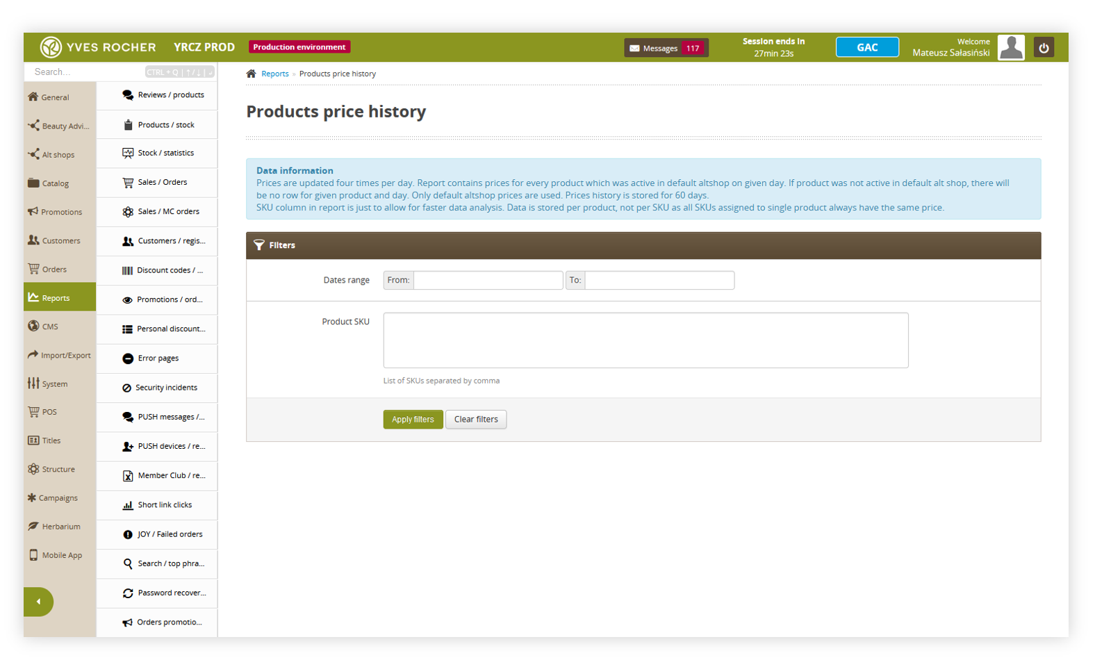 |
| *Visualization of the products price history* |
| 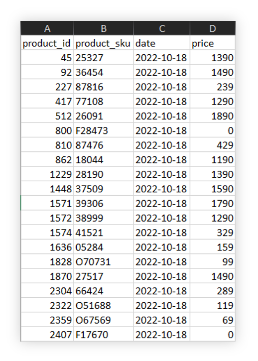 |
| *Visualization of the products price history xlx file* |
|  |
| *Visualization of the omnibus functionality when current catalog price is higher than previous one* |
| 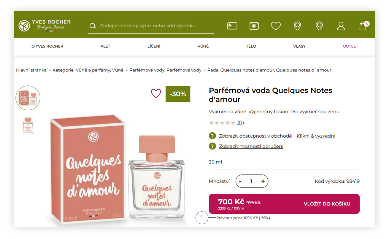 |
| *Visualization of the omnibus functionality when current catalog price is lower than previous one* |
| 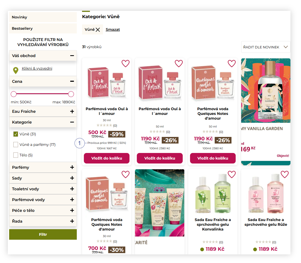 |
| *Visualization of the products in the product catalog (desktop* |
| 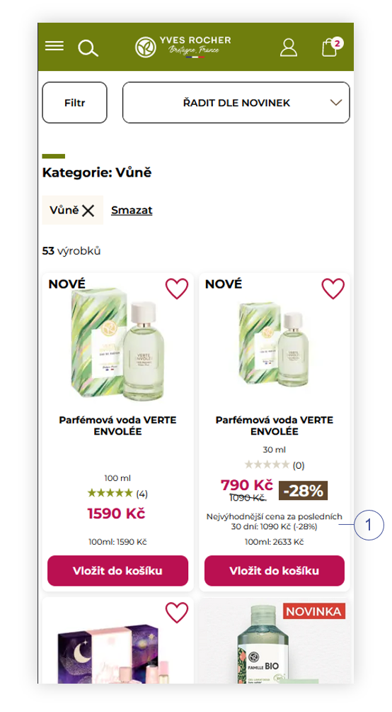 |
| *Visualization of the products in the product catalog (mobile)* |
| 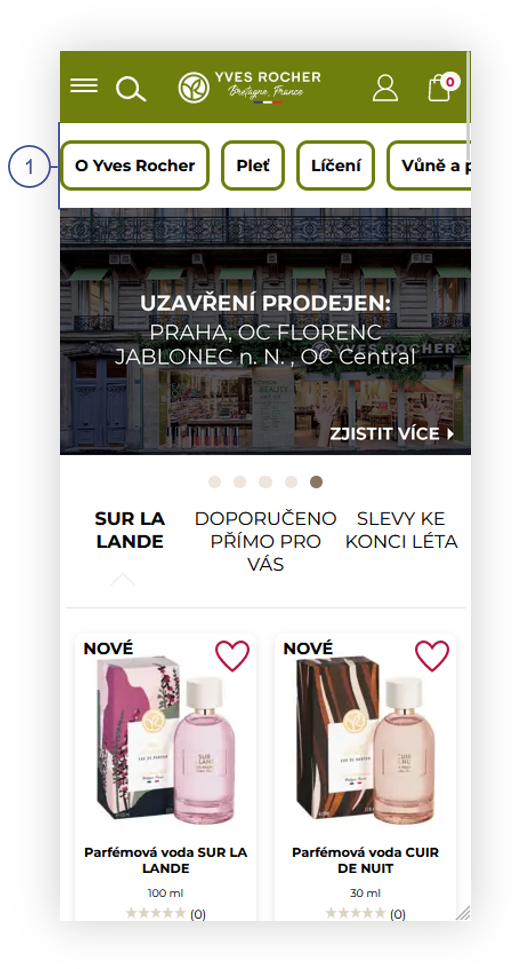 |
| *Visualization of the mobile view of the home page.* |
| 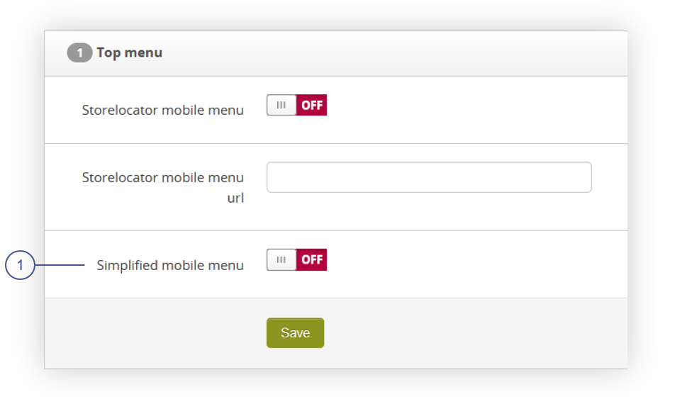 |
| *Visualization of the top menu tab* |
|  |
| *Visualization of the mobile top menu when functionality is turned off* |
|  |
| *Visualization of the mobile top menu when functionality is turned on* |