CMS
Configurable CMS block
 Getting started
In this article, you can learn about configurable CMS block functionality, which will allow you to put and properly configure banners visible on a website. There are two defined CMS blocks:
- above_cart_steps_banner - Displays a configured banner only in a cart page (/cart).
- above_layout_content_banner - Displays a configured banner everywhere except the customer panel, cart page, and checkout.
As with every CMS block that is configured to be visible on a homepage it is important to make sure, that created CMS block has exactly the same name as provided above. If the CMS block has a different name it won't be displayed on a website.
 |
| Visualization of the above_cart_steps_banner in a /cart page |
 |
| Visualization of the above_layout_content_banner on a homepage |
 RememberYou can find more about CMS blocks creation and configuration in the CMS blocks article.
Table of contents:
Configuration
 |
| Visualization of the configurable block configuration |
In order to see the new JSON field you have to select the configurable block type.
The
- visibility (string) - Sets if the selected block is visible for all users, only logged-in users, or only logged-out ones. Available options are: all, logged_in, logged_out
- closeable.position (string) - Sets the position of the close (X) button. Available positions are: top-right, top-left, bottom-right, bottom-left
-
closeable.color (string) - Sets the close (X) button color. Available options are:
- primary - Green.
- secondary - Red.
- closeable.time (integer) - Sets after how many hours the banner will be visible to the customers again after they closed it.
-
width (string) - A CMS block width option. There are three possible widths:
- full - Banner is stretched to fit the entire width of the screen. Please remember, that a proper background image has to be prepared for it to fit.
- full-bg - Banner has the same width as the container width, but the rest of the screen width is colored with a color set in the background parameter.
- container - Banner width that fits the website layout. The banner width is set to 1248px for the desktop view - the same as the slider.
- background (string) - A background color that is visible when a full-bg width is selected. This value should be in hex i.e. #0AA78F
- bottomShadow (boolean) - A small shadow below the banner that is visible whenever widths full and full-bg are selected. This field accepts true and false values.
Example of a valid JSON:
{"visibility": "all", "closeable": {"position": "top-right", "color": "secondary", "time": 1}, "width": "full-bg", "background": "#0AA78F", "bottomShadow": true}
It is possible to configure these blocks to change their state according to users login status (logged in / logged out) and have them still visible for all groups in the visibility property. This needs to be coded in the CMS block HTML content.
RememberYou can find examples of checking of the current cart value and verification of the user logged in / logged out status in the Public JS API article.
Featured products list
Getting started
In this article, you will learn about the featured products list. Featured products list functionality allows displaying new, selected, or Exponea products in the respective tabs on the home page of the website below the slider (1). This block is responsive, so products will be correctly visible both on desktop and mobile devices without additional input.
Featured products need to be activated in the desired altshop in order to be visible on the website. You can find more about activating featured products in the Featured products / list - browsing and managing featured products in altshop module article.
 |
| Visualization of the featured products on the home page (desktop view) |
 |
| Visualization of the featured products on the home page (mobile view) |
To open the Featured products / list view, in the admin panel, navigate to:
Alt shops > Featured products / list
All possible operations to perform on the Featured products / list view can be done in the Filters (2), and Featured products / list (3) tabs.
 |
| Visualization of the featured products / list |
Table of contents:
- Filters section
- Featured products / list
- Adding new featured products
- Configuring featured products list
Filters section
The Filters section allows sorting of the featured products in the CMS module, based on the available filters. Below you will find a description of available filters
 |
| Visualization of the filters tab in the Featured products / list module |
- Is active? - Featured products list activity status.
After defining the above filters, select the Apply Filters button to get a list of sites according to the applied filters.
Featured products / list
The Featured products / list section allows organizing the filtered featured products, edit them and create new ones, delete them, and search for the desired featured products list.
Below you will find a description of all possible actions you can perform in the featured products / list section.
 |
|
Visualization of the select list section in the Featured products / list module |
- Select the Show X entries(1) field to set the number of featured products, displayed on one page (min 10 / max 100).
- The names of the columns (2) that contain information about a target featured products list. Each column is susceptible to sorting.
To sort the records, click on the title of the column in question.
- ID - An internal ID of the featured product list.
- Name - The system name of the featured product list.
- Public name - Name of the featured product lists that is visible to the customers.
- Sort order - Featured products sort order. The active list will be displayed in order according to this value.
- Is active? - Activity status of the featured products list.
-
Actions - List of buttons with possible actions that can be done to the desired featured product list:
- Edit - Edit desired featured products list. You can find more about editing in the Configuring featured products list chapter.
- View - Allows to view the content of the featured products list without the ability to edit any fields in it.
- Delete - Deletes the featured products list without the ability to restore it.
- Select the Add (3) button to go to the adding the new featured products list. You can learn more about adding of the featured products in the Adding new featured products list chapter.
- Search box (4) where you can search for featured products list by their system name.
- Page buttons(5), which allows user to change the page of currently viewed featured products lists.
Adding new featured products list
Below, you will find a description of all possible fields that can be edited while creating a new featured products list.
 |
| Visualization of the adding of the featured products list |
- Name - The system name of the featured product list.
- Public name - Name of the featured product lists that is visible to the customers.
- Is active? - Activity status of the featured products list.
- Sort order - Featured products sort order. The active list will be displayed in order according to this value.
-
Type - A type of the featured products list. You can find more about information about types in the Configuring featured products list chapter. The available types are:
-
Custom - Custom added products and their sort order
- Bestsellers - Custom added products and their sort order with additional recommendation of bestselling products list
- News - Newly added products
- Exponea recommendations - Products configured in the Exponea. More about Exponea integration can be found in the [UNDER CONSTRUCTION] article.
-
Custom - Custom added products and their sort order
With all necessary fields filled, you can save the changes using the save button, and add the products to your list by editing it. More about editing the featured products list can be found in the Configuring featured products list chapter.
Configuring featured products list
As users are unable to add products to their featured products list during its creation, it is needed to edit the desired list. Below you will find different types of product lists.
Custom
Custom type allows users to add their desired products to the list and change their sort order.
 |
| Visualization of the custom type |
You can change the sort order of the products by using the drag & drop functionality.
Products will show alerts next ot their name in case of product having no stock, or being inactive. You can remove the products by pressing the "remove" buton.
Bestsellers
Bestsellers type works exactly like custom type, but has one additional tab, where products are visible with their sold quantity, which helps to decide which products should be visible. You can add products by pressing the "Add to list" button
 |
| Visualization of the bestsellers type |
In the Bestsellers propositions tab you can also hide the unwanted products by pressing the hide button.
You can change the sort order of the products by using the drag & drop functionality.
Products will show alerts next ot their name in case of product having no stock, or being inactive. You can remove the products by pressing the "remove" buton.
News
News type automatically adds and changes the products visible in the featured products list. It shows only the newest products.
Exponea recommendations
Exponea recommendations tab allows to select an Exponea product block from
CMS > Exponea / Recommend Product Block
 RememberYou can learn about the Exponea functionality in the [UNDER CONSTRUCTION] article
 |
| Visualization of the adding of the exponea recommendations type |
Friendly URLs
Getting started
This article describes Friendly URLs and their aliases. Friendly URLs are links that are assigned to created content for example CMS pages, products, promotion pages or opensets.
Friendly URLs can have assigned aliases, which will redirect the user to the selected friendly URL using the custom-made alias.
To open the Blocks / list view, in the admin panel, navigate to:
CMS > Friendly URLs / list
In the Friendly URLs / list view, we can find one tab: Friendly / URLs (1)
 |
|
Visualization of the Friendly URLs / list page |
Friendly URL aliases are located in the:
CMS > Friendly URLs / Aliases
In the Friendly URLs / aliases view, we can find two tabs: Filters (2) and Friendly URLs / aliases (3)
 |
|
Visualization of the Friendly URLs / aliases page |
Table of contents:
Friendly URLs / list
Friendly URLs / list section contains all the already assigned URLs from all the products, CMS pages, Opensets and Promotion pages.
Friendly URLs are created in their respective categories, for example creating a new CMS page with URL /New_CMS_Page will create and assign automatically a friendly URL /New_CMS_Page to the created CMS page.
Below you will find a description of all possible actions you can perform in the Select block section.
 |
|
Visualization of the Friendly URLs section |
- Select the Show X entries(1) field to set the number of friendly URLs, displayed on one page (min 10 / max 100).
- The names of the columns (2) that contain information about a target friendly URL. Each column is susceptible to sorting. To sort the records, click on the title of the column.
- ID - An internal ID of the Friendly URL.
- Request path - The URL of the friendly URL.
- Related element - An element of the website assigned to the friendly URL (i.e., CMS block, promotion page, a product, openset).
- Update time - Last update time of the friendly URL.
- Actions - An Edit button that redirects the user to the selected element where the friendly URL is located (i.e. CMS block, promotion page, a product, openset).
- Search box(3) where you can search for desired friendly URL by its request path.
- Page buttons(4), which allows user to change the page of the friendly URLs.
Friendly URLs / aliases
The Friendly URLs / aliases section allows organizing the filtered aliases, editing them, and adding the new ones.
Aliases are alternative URLs that will redirect to the source URL. For example, if the source URL is a
"/Source_URL", and we create an alias "/New_link" customer can access the /Source_URL through the /Source_URL link and /New_link, as it redirect to the source link.
Filters section
The Filters section allows sorting of the aliases, based on the available filters.
Below you will find a description of each filter.
 |
|
Visualization of the filters section in the Friendly URLs / aliases |
- Update time - A range of dates, that filters the available aliases by their update time.
After defining the above filters, select the Apply Filters button to get a list of sites according to the applied filters.
Friendly URLs / aliases section
The Friendly URLs / aliases section allows organizing the filtered aliases, editing them, and removing of the unnecessary ones.
Below you will find a description of all possible actions you can perform in the Select block section.
 |
|
Visualization of the Friendly URLs / aliases section |
- Select the Show X entries (1) field to set the number of aliases, displayed on one page (min 10 / max 100).
- The names of the columns (2) that contain information about a target aliases. Each column is susceptible to sorting. To sort the records, click on the title of the column.
- ID - An internal ID of the alias.
- Request path - The URL of the alias.
- Target path - The target URL.
- Update time - Last update time of the alias.
-
Actions - List of buttons with possible actions that can be done to the desired alias:
- Edit - Edit desired alias. Editing is exactly same process as adding a new alias.
- View - Allows to view the content of the alias without the ability to edit it.
- Delete - Deletes the alias without the ability to restore it.
- Import (3) button, which imports the prepared aliases from an xlsx file. You can find more about it in the Importing aliases section.
- Export (4) button, which exports all filtered aliases to an xlsx file.
- Select the Add (5) button to go to the adding the new alias. You can learn more about adding of the aliases in the Adding a new alias chapter.
- Search box (6) where you can search for desired alias by using their request or target path.
- Page buttons (7), which allows user to change the page of the aliases list.
At the bottom of the page you will find a Mass removal tab, which contains the Remove all url aliases button.
 |
|
Visualization of the Friendly URLs / aliases section |
By pressing this button you will remove all aliases in the environment database without an ability to restore them. Please use this option only if previously created aliases have been exported beforehand and are ready to be imported.
 |
|
Visualization of the Friendly URLs / aliases section |
After pressing the Remove all url aliases button there is a pop-up that warns the user, that it is an irreversible process, and an additional confirmation is required by pressing the Yes, remove all button. This process at this point still can be cancelled by pressing the No button.
Adding a new alias
 |
|
Visualization of the adding of the new aliases. |
While creating a new alias or editing an existing one, you have to specify the:
- Request path - The URL of the alias.
- Target path - The target URL.
For example, if you want customers to access the promotion page "/New_promotion" by URL "/New_link" we need to type "/New_link" to the Request path, and "/New_promotion" to the Target path.
After typing the necessary URLs you can save the changes with the "Save" button.
Importing aliases
Aliases can be imported using the import functionality. This can be done by pressing the import button in the CMS > Friendly URLs / Aliases, or by directly accessing Import / Export > Import and selecting the Aliases option.
 |
|
Visualization of the adding of the new aliases. |
The prepared file needs to be in an xlsx format and it has to contain the following columns:
- request_path - The URL of the alias.
- target_path - The target URL. Must start with a slash ("/").
The request path and target path cannot contain exactly the same URL in the same row.
An example of an incorrect path:
| request_path | target_path |
| /Webpage | /webpage |
As both request_path and target_path contain exactly the same URL it will create a loop when accessing it. This option will result in an error when trying to import such an alias.
The import mechanism has validation, that automatically cancels the import of aliases if they contain the same URL in request_path and target_path as well as if the target_path doesn't start with a slash ("/").
The import mechanism can only add new aliases. For alias removal please remove the unnecessary aliases in CMS > Friendly URLs / Aliases by pressing the delete button next to the alias, or remove all aliases from the database by pressing the Remove all url aliases button, and import the correct aliases from an xlsx file.
Banner notifications
Getting started
This article describes Banners / list tab in the admin panel, which will allow users to create header and side notifications on the website. Notifications work like CMS blocks using HTML + CSS code, and can be activated on specific altshops.
There can be more than one header banner (1) visible at the same time. When the top banner is closed by the client, it will be not visible to the customer for configured in the System / Settings amount of days.
 |
|
Visualization of the banners on the homepage (Desktop view) |
 |
|
Visualization of the banners on the homepage (Mobile view) |
Table of contents:
Configuring the banners
 RememberEvery created banner needs to be activated in the desired altshop. More about activating banners in the altshops can be found in the Banners / list - browsing and managing banners in altshop module article.
 |
|
Visualization of the Banners / list tab |
In this tab we can also find columns (2), that can be sorted, with basic information regarding the banners:
- ID – Internal ID of the banner.
- Location – Top or Side location.
- Name – Internal name.
- Start and End date - Range of dates when the banner should be visible.
- Is Active? – Status if the banner is currently active.
- Sort order – Sort order of the banner.
- Update time – Last update time done by the user.
-
Actions - Three action buttons that allows to
- Edit selected banner. Editing is the same action as Add, but with already existing element. More about it can be read below.
- Duplicate selected banner. Duplicate creates exactly the same banner, but with a (x) at the end of the name (where X is a number).
- Delete selected banner.
In order to create new banner, we need to click on the Add (3) button
It is possible to search for a desired banner by their name using the search box (4), change the pages when the number of banners is by default bigger than 10 (5), and see how many banners are currently visible on the page out of them all (6).
 |
|
Visualization of the new banner creation |
When creating new banner, we can specify:
- Name – Internal name.
- Location – Top or Side location.
- Sort order – Sort order of the banner.
- Start and End date - Range of dates when the banner should be visible.
- Is Active? – Status if the banner is currently active.
In the content tab, we need to type HTML code in order for it to be visible on the website for the customer.
Example code for Top banner:
<div style="width: 100%">
<p style="text-align:center;">Connectes-vouz our creez votre compte pour profiter de vos <strong>avantages exclusifs</strong></p>
</div>
Example code for side banner:
<style type="text/css">.side-banner-content {
height: 100%;
color: #fff;
display: flex;
justify-content: center;
align-items: center;
}
</style>
<div class="side-banner-content">
<p style="color: #fff;">Connectes-vouz our creez votre<br />
compte pour profiter de vos<br />
<strong>avantages exclusifs</strong></p>
</div>
With the correctly filled necessary fields and code, we can save the banner.
System / settings configuration
 |
|
Visualization of the Layout banners tab in the System / settings |
There we can find two options, one for top banner and second one for side banners.
Customer perspective
Created and configured banners will be visible on the website. Top banners (1) and side banners (2) are visible on every page.
|
|
Visualization of the banners on the homepage (Desktop view) |
|
|
Visualization of the banners on the homepage (Mobile view) |
Pseudo tags
Getting started
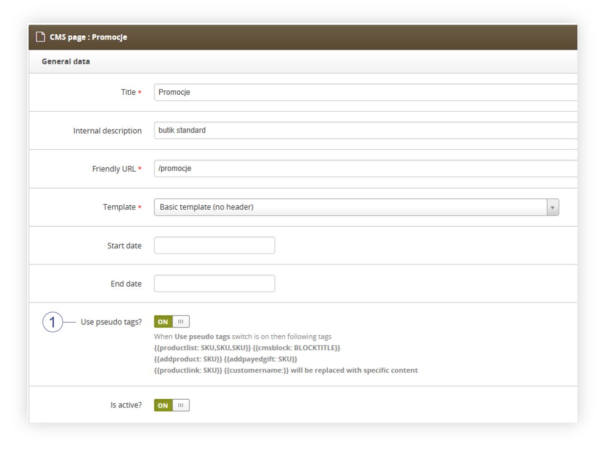
This article describes the pseudotag system that is used by the CMS blocks and CMS pages to dynamically display content in them.
 |
| Visualization of the example usage of a pseudotag |
For pseudo tags to work, they need to be enabled in the selected CMS block or page by turning on the Use pseudo tags? button (1). When this button is turned off the pseudo tags won't be converted into dynamic content.
 |
| Visualization of the use pseudo tags? button. |
Table of contents:
Available pseudo tags
Pseudo tag is defined by name and parameters of the pseudo tag in double curly braces "{{ }}". The pseudo tag is defined in the following order: {{PseudoTag: SKU,SKU,SKU argument:true}}
| Name | Available arguments |
| cmsblock | Title of a CMS block |
| addpayedgift | SKU number of a product |
| addproduct | |
| productlink | |
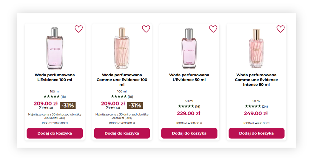
| productlist |
reload:true - sets if the add to cart modal should be shown to the customer. If this argument is set to false customer will see add to cart modal, if it's set to true customer will remain on the page. |
| blockproductlist | |
| productlistsmall | |
| productlistcolor | |
| productlistsmallcart | |
| productlistbig | |
| treescounter | N/A |
Example of a pseudo tag:
{{productlistsmall:69296,86429,47043,38421 limit:2}} - will show a list of products with buttons to add them to the cart. Only 2 products will be displayed, even when the number of specified SKUs is bigger than 2.
{{productlist: 55555,53212,12345 reload:true}} - Will show a product list of the selected SKUs with a button that allows customers to add these products to the cart. After pressing the "add to cart" button customers won't see a modal confirming that option, but they will remain on the webpage.