Mobile app: Carousel
 Getting started
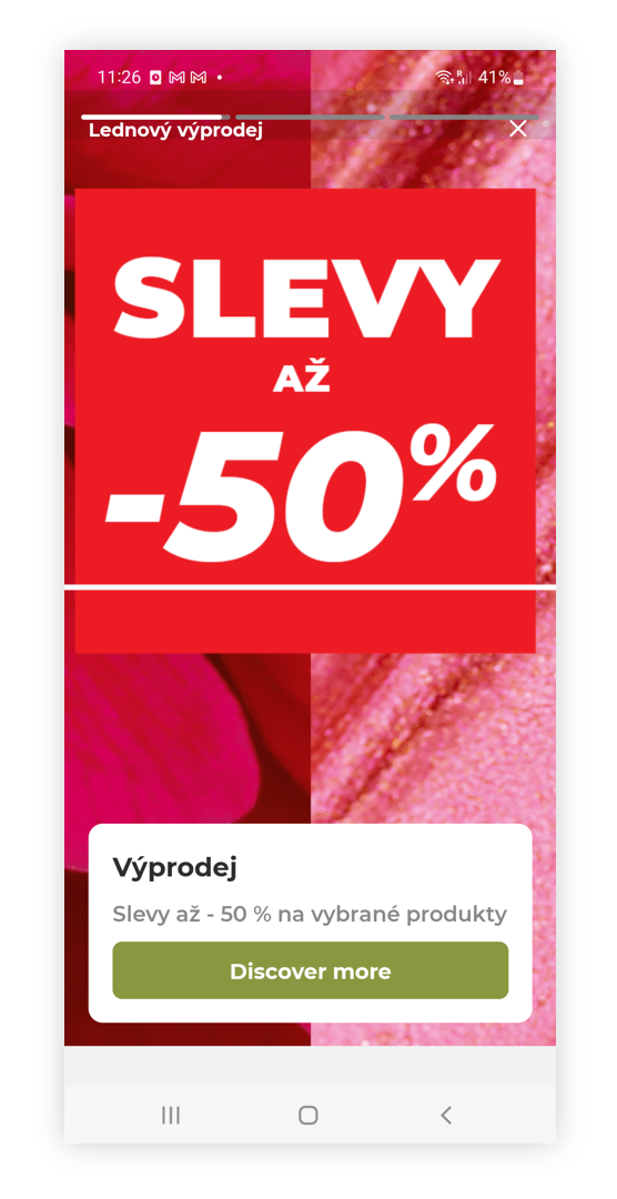
In this article, you can find information about the mobile app: Carousel sub-category. Carousel is equivalent to sliders on the e-commerce platform, except it shows only the first carousel depending on their sort order and after selecting it customer will see a story (similar to Instagrams stories), where every available carousel is visible for a short time.
 RememberYou can find more information about the mobile app and other sub-categories in the Mobile app article.
 |
| Visualization of the carousel story on the mobile app |
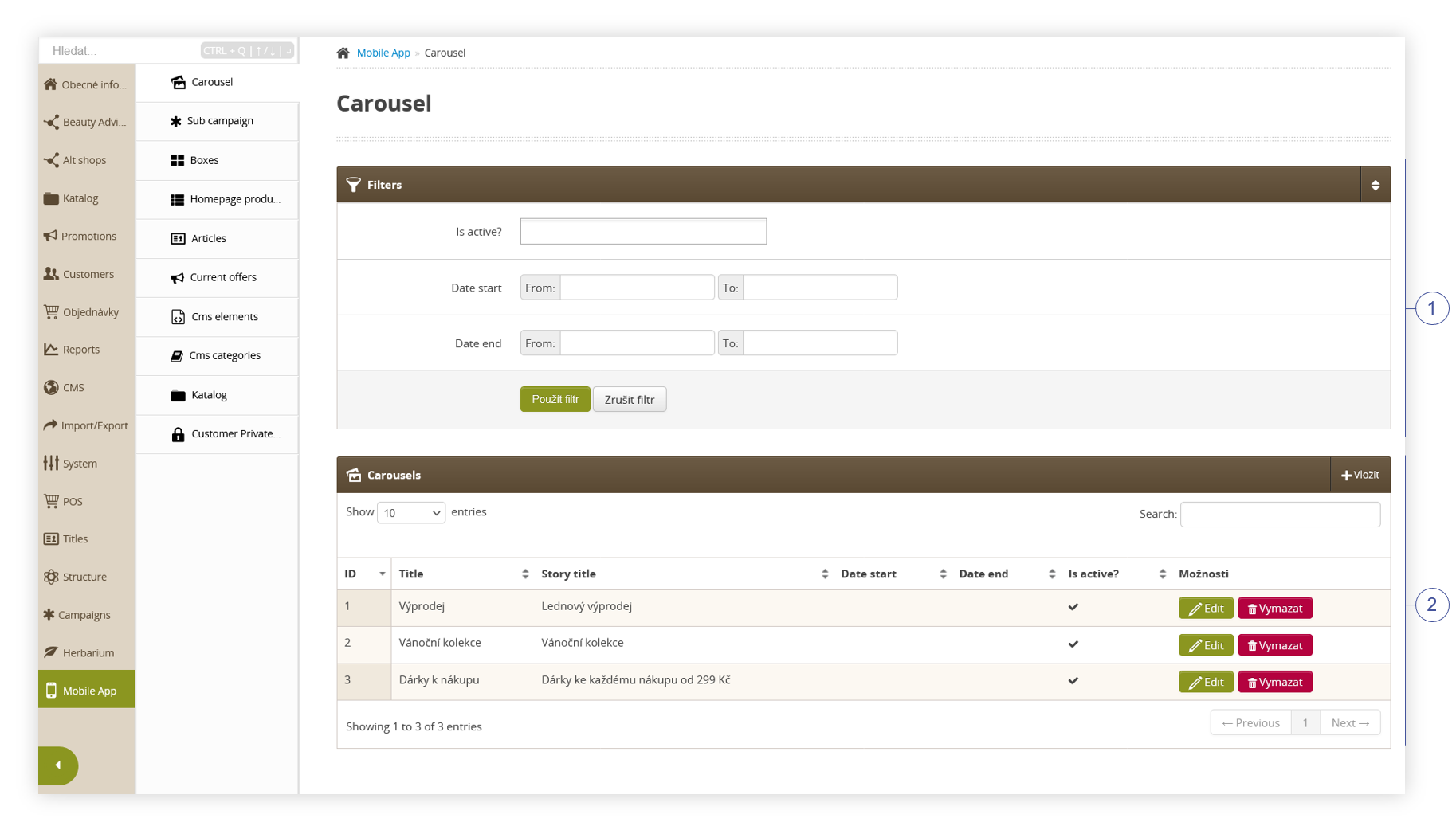
To open the Carousel view, in the admin panel, navigate to:
Mobile app > Carousel
All possible operations to perform on the Carousel view can be done in the Filters (1), and Carousel (2) tabs.
 |
| Visualization of the carousel sub-category |
Table of contents:
Filters section
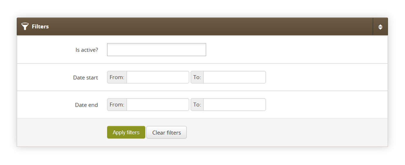
The Filters section allows sorting of the carousel in the mobile app module, based on the available filters. Below you will find a description of available filters
 |
| Visualization of the filters section |
- Is active? - Carousel activity status.
- Date start - A range of dates that indicate the start date of the carousel.
- Date end - A range of dates that indicate the end date of the carousel.
After defining the above filters, select the Apply Filters button to get a list of sites according to the applied filters.
Carousel
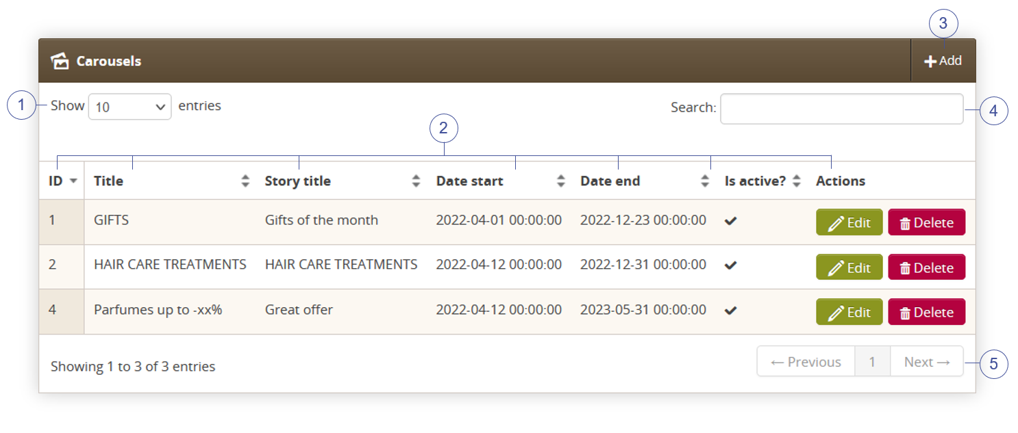
The Carousel section allows organizing the filtered featured carousels, edit them and create new ones and delete them.
Below you will find a description of all possible actions you can perform in the Carousel section.
 |
| Visualization of the carousel section |
- Select the Show X entries(1) field to set the number of carousels, displayed on one page (min 10 / max 100).
- The names of the columns (2) that contain information about a target carousel. Each column is susceptible to sorting.
To sort the records, click on the title of the column in question.- ID - An internal ID of the carousel.
- Title - Internal title of the carousel. This field is not visible to the customers
- Story title - Story, public title of the carousel. This field is visible to the customers.
-
Date start - Start date when the carousel will be visible to the customers.
-
Date End - End date when the carousel will be hidden from the customers.
- Is active? - Activity status of the carousel.
-
Actions - List of buttons with possible actions that can be done to the desired carousel.
- Edit - Edit desired carousel. As editing contains exactly the same fields and actions as creating a new carousel you can read more about it in the Creating a carousel chapter.
- Delete - Deletes the selected carousel without the ability to restore it.
- Select the Add (3) button to go to the adding the new carousel. You can learn more about adding of the carousel in the Creating a carousel chapter.
- Search box (4) where you can search for carousels by their system name.
- Page buttons(5), which allow users to change the page of the currently viewed carousel.
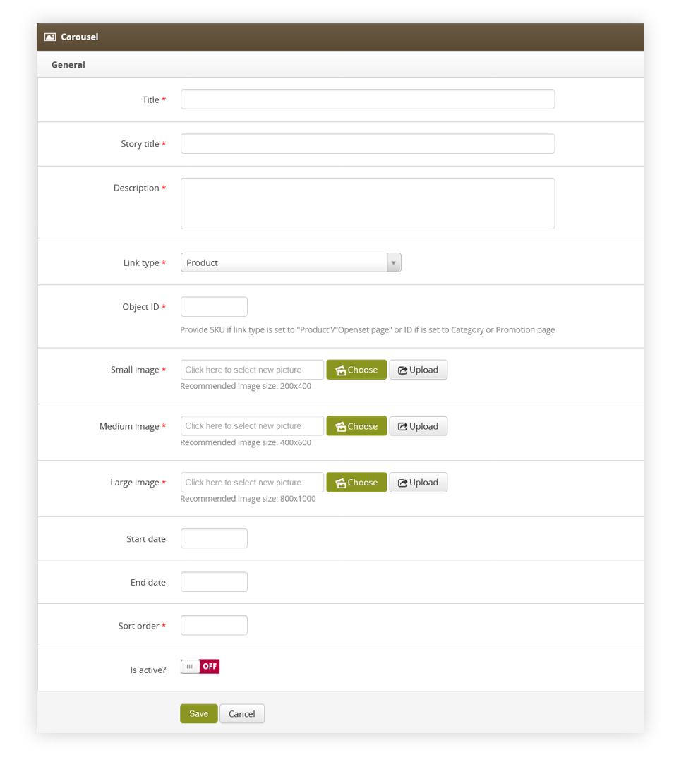
Creating a carousel
Below, you will find a description of all possible fields that can be edited while creating a new carousel.
 |
| Visualization of the creating the carousel |
- Title (mandatory) - Internal carousel name. This field is not visible to the customers.
- Story title (mandatory) - Public carousel name. This field is visible to the customers.
- Description (mandatory) - Description of the carousel. This field is visible to the customers.
-
Link type (mandatory) - Type of a link available in the carousel. Depending on the selected type the Object ID field will require different input. There are 5 types of links:
- Product - Product available on the website.
- Category (tag) - Category tag available on the website.
- Promotion page - Promotion page available on the website.
- Openset page - Openset page available on the website.
- Custom view - Custom object programmed by the mobile app developers.
-
Object ID (mandatory) - ID of an object selected in Link type section.
- Product - Product SKU i.e. J12345
- Category (tag) -Tag ID i.e. 76938
- Promotion page - Promotion page internal ID i.e. 1234
- Openset page - Openset internal ID i.e. 765
- Custom view - Custom field that doesn't have any validation. Custom values configured and programmed by mobile app developers can be put here.
- Small image (mandatory) - Small image of the carousel. Recommended image size: 200x400.
- Medium image (mandatory) - Medium image of the carousel. Recommended image size: 400x600.
- Large image (mandatory) - Large image of the carousel. Recommended image size: 800x1000.
-
Start date - Start date when the carousel will be visible to the customers.
- End date - End date when the carousel will be hidden from the customers.
- Sort order (mandatory) - Sort order of the carousel. The lower the sort order the earlier in the order selected carousel will be visible to the customer.
- Is active? - Switch, which defines if the selected carousel is visible in the mobile app.
With all necessary fields filled, you can save the changes using the save button.
Application view
Customers accessing the Yves Rocher application will view the carousel with the lowest sort order a the top of the page.
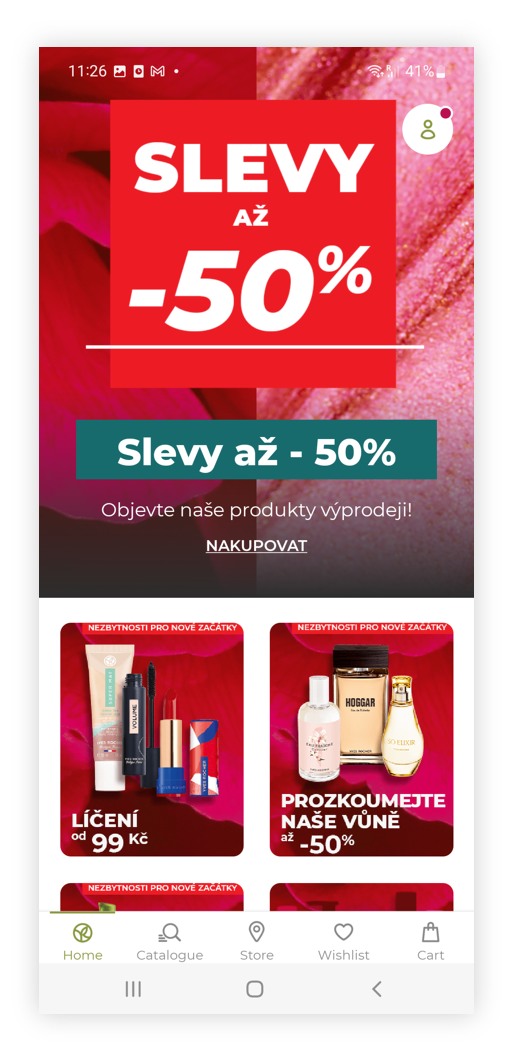 |
| Visualization of the carousel on the mobile app |
When selecting the carousel it will open carousel story where the carousel will change the slide every 10 seconds.
|
| Visualization of the carousel story on the mobile app |
Selecting the discover more button will redirect the user to the desired page set in the "link type" and "object id" part of the carousel.
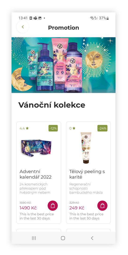 |
| Visualization of the promotional page |